Tuesday, January 27, 2015

Plethora of Bowls

Artist: Chris Baskin

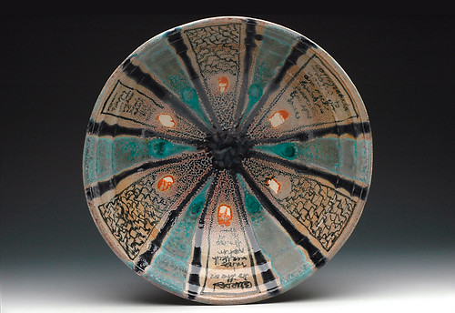
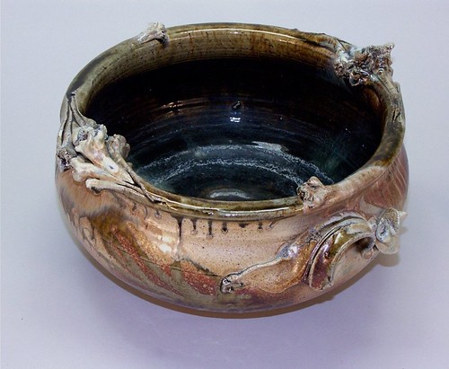
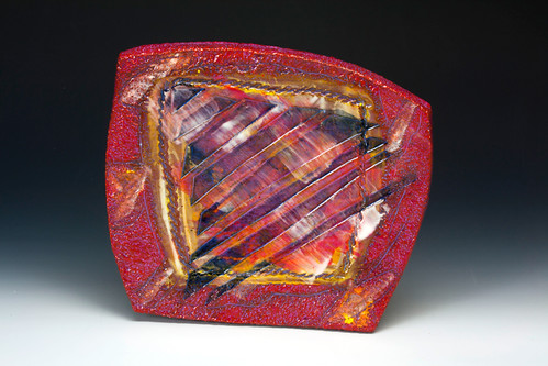
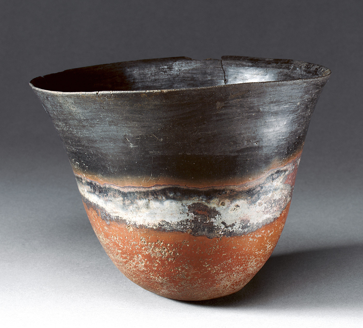
What really speaks to me about this piece is the shapes and colors inside the bowl. The aquamarine blue in the center that fades to a grayish teal is really nice on the eyes. I also like inside the triangular shapes that there's an orange tit so it brings a complimentary aspect. The thick black bold outlines are also really pleasing to look at. The ripples created within the bowl add a great texture to the overall piece.

Artist: Tom Rohr

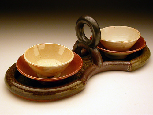
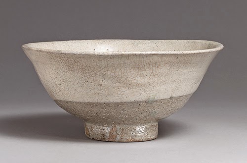
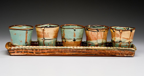
The neutral reddish colors really stuck out compared to the other bowls I was looking at. Also the overall composition is really pleasing to look at. I like the simplicity of the bowls and the cream color they have. The wider bowls holding them is also really great to look at and I love that red-orange color. The stand is really unique and I love the shape the artist went with to make it. The intricate design really makes the piece pop and the colors picked really brings everything together as a set.


Monday, January 26, 2015


This is a bowl made by Linda Arbuckle that I found on AccessCeramics.

I really like the notches in the side of the bowl, and the bright colors, in contrast with the black lines.
I also like the natural design it has on it, which reminds me of autumn. For my bowl, I want it to be for cereal or soup, and simple, yet with bright colors.


http://accessceramics.org/results/object/1/

I really like the shape of this bowl by Louis Reilly. I like the ridge on the feet of the bowl as well as the outward curvature on the lip of the bowl. I think I will try to embody this type of look in my bowl. I also really like the soda fired technique on the outside of the bowl, I think it is very cool looking.


http://accessceramics.org/results/object/1/

What stood out to me from this piece by Victoria Christen was the four edges in the lip of the bowl. Not only do I think that it gives the bowl some flare, but I also think that it would be a practical bowl to drink from these edges without the substance sloshing around the sides. I wonder if this is something that I will be able to incorporate into my bowls.


Bowls and More Bowls

30 bowls? Seems like a crazy amount of dishes. Although, I do have a rather large family. Perhaps I can invite everyone over for soup.

Seriously though, I have a thing for sets and things that match. First a look at a historical bowl. I found this one (thanks to one of the links) that I really like. Its a Chinese tea bowl. I really like how its  shaped, and how the emphasis is more on practicality not on beauty.

http://www.metmuseum.org/toah/works-of-art/91.1.226
Song Dynasty Tea Bowl


I love bowls that are at more of an angle on the sides. Really, what is the point of a bowl when the sides are so flat it looks like a plate? You can't eat cereal from a plate, well maybe you can but I sure can't. For my bowls I hope to make something that is deep and can hold a good amount of ice-cream. 

For my modern bowl I found this one on AccessCeramics. It too has the nicely sloped sides. I really love the color of this one. It has a down to earth feel, and it looks very organic and natural. Like the tea bowl above it is functional and beautiful without shouting in your face about design. 

http://accessceramics.org/results/technique/7/
Jan Schachter, Thrown, 2011

Some Sketches. I want to have deep bowls. I have no idea how I want to decorate them yet. I considered what a square bowl would be like, but I am not sure if you can make a square bowl on the wheel. Perhaps a bowl with a square foot. 


Bowls

This is a bowl by Edward C. Moore. I enjoy the simple shape of the bowl and the color used. I also like the foot of the bottom of the bowl.
These pieces were made by Hayne Bayless. I really like the square shape to them, and the curved edges. I want to experiment with different shapes, so this is one i can consider.
My ideas include doing one decently big bowl, and maybe doing them to fit inside of each other too. Also maybe doing a square shaped one.

Assignment 2 | Kirsten Cox

HISTORIC

Bowl, Ptolemaic Period, ca. 200–150 B.C., Egyptian
The contrasting colors and patterns really stood out. The wave-crest pattern is something I would like to try myself. It is a historically common pattern so there would be opportunities for me to look at different techniques and experiment.

Trophy Bowl, Don Reitz © 1980

This bowl’s intricate and detailed accents along with the organic splashes of colors caught my eye. The gradient colors within the bow are just as interesting as the uniqueness of the outside. This piece is inspirational for our next assignment because of the additions to the handles and rim.


SKETCHES

I want to experiment with shallow bowls and adding handles and/or accents.


my helper

Assignment 2


This is the historical peice made by Harrison McIntosh in 1960. I feel like the patterns n the outside reflect a lot of what patterns were popular back then. There was a lot of bubbly, round, fluid imagery in the 60's and that's shown here. Even in the shape of the bowl, it looks bulbous and hard to hold, like it would just be used for serving or something. This was on AccessCeramics.


These are Hayne Bayless's bowls I got from AccessCeramics. I love the idea of having bowls and dishes of weird shapes, like triangle bowls or square cups. The firing and glaze look beautiful on these. He used a cone 10 temperature with copper glaze and resist. I know we can't really make non-circle bowls on a wheel but I want to make something like these eventually.


This sis a fractal serving dish by Sarah House, also on AccessCeramics. What i love about these is, not only the color and finishes, but that they're really handy. You could use them altogether or each one as an individual bowl (except maybe the smallest bowls). These serve a variety of purposes and probably also take up less space in the cupboard haha.


These are my plans. I don't know what I want to do in terms of decoration, I"ll figure that out along the way. I think it'd be cool to have a big bowl with a little silverware holder for those times when the spoon is too short to lean on it properly and it falls in your food. A lot of this is driven by convenience and use so far, I might just end up doing the tri-point bowls later, I don't know.


Sunday, January 25, 2015

Bowls on bowls with bowls

Fist off this is pretty awesome. These are the fractal serving dishes made by Sarah house found on Access Ceramics. A whole set of bowls that fit together!! I like this a lot because of the glazes used and the simple yet interesting design of these bowls.


 The simple design of these japanese bowls that have textured designs of animal fur on the outside of the bowls. The texture is what I like most about these bowls since they show detail to simulate fur of animals that they probably hunted.

these are a few designs inspired by the ones above to see how it would all turn out if I did something similar or not. The designing of the glaze textures would be pretty simple but maybe some texture on the bowls would be pretty cool too..

Assignment #2


For my historic piece, I chose this tea bowl from metmuseum, made by Tanaka Chojiro from around 1575. I am majoring in Japanese, so this bowl caught my eye. I enjoy the rough texture this piece has. Although this piece was not wheel thrown, I might try to emulate the rough texture and look on some of the bowls I make for this assignment.  I also enjoy that I can see bits of the clay peeking through the black glaze.


For my contemporary piece, I chose this bowl from accessCeramics. Around the studio, I see a lot of people's work having "rings" around their bowls, and this bowl from Ginny Marsh seems to be very smooth. The glaze is also fantastic. I like the rough look of the bits of black in the middle of the piece, and also with the edges joining with the orange and blue colors as well. AccessCeramics states that this piece's glaze is layered, Also, I'm not sure if there's glitter on this bowl or not (it looks sparkly where the light hits it? I don't know). I don't think glitter would be allowed in the studio, so I think I'll stick to the standard slips and glazes we have available to us.


For my pieces, I want to try to incorporate either the glaze technique from Ginny Marsh, or get the rough feel from the Japanese bowl. I don't even know if a rough texture is possible with the wheel, as I've never done it before. As for the decorations on my bowls, I might try to add some animals representing the types of food that goes in my bowls. For example, maybe I would add a deer to a bowl that would contain only vegetarian meals. I might try to get fancy and add some mythological animals to my bowls (we'll see how that goes).

Bowls

 The first bowl is by Ben Krupka, and I found it on access ceramics. I really enjoy the simplicity of this piece and how its slightly altered after being thrown. The subtle design is something id like to add to my work.
This bowl is a Korean artifact from the sixteenth century, and I found it on metmuseum. Its very similar to the contemporary piece but I think I like the shape more when it pulls out further at the top.
This is my s
ketch, I am thinking of trying to keep the simplicity of the two pieces I found with some nice details of vegetables and fruit. Haven't quite decided what fruits and veggies yet though.

Wednesday, January 14, 2015

Assignment 1


These are plates by Sean O'Connell called "Nonagonal Plates". What really drew me to these was the diagonal lines in the outer circle that bend when they touch the ring. I love how the line thickness changes to create a kind of jagged movement towards whatever's on the plate. I can imagine it would make it uneasy for some people to eat off this with the pattern but personally, I'd see it as a wonderful visual accent to the meal.


This tea set is by Tom Rohr and is called "Coffee Service". I'm attracted to the finish and the color og the glaze for these pieces. I love how he made a ceramic set look like molten metals. He used glaze at a highfire temperature. I don't know if it's a certain glaze that acheives the metal look or how it was fired but I hope to put a metallic finish on my work. 


My plans. I hope to have a white pearly finish with matte dots and accents but I don't know if I'll end up doing this design.

Monday, January 12, 2015

Research Assignment One >>> Kirsten Cox


Two-Tone Grey and Blue Yunomi
What I like about Jeff Campana’s cup is the unity while using separate pieces. The form is representational of a flower and the contrast between natural form and the color choice is unique.

Small Grey and Dark Blue Small Yunomi

Nights at the Museum. 2014
This platter by Heather Mae Erickson catch’s my eye because I enjoy the playfulness of the dots along with the shape. I love to cook and I can envision a wonderful dinner with this set. The shape is something that is distinctive but practical for its purpose.
AshleighMillerPhotography
AshleighMillerPhotography, BMoCA, Nights at the Museum.


My Sketches


Assignment 1


I found these cups on AccessCeramics by Victoria Christen. What I really enjoy about these cups is the multiple layers. Not so much what is actually ON the cups, but I like the concept of having the layer. To make this my own, I plan on removing the handle and making the cups smaller, like a shotglass.
Victoria Christen: Five Tumblers on Tray
Also on AccessCeramics by Victoria Christen, was this set of 5 cups and a tray. Basically showing what I want to do with the cups.


I couldn't find a tray style that I was fond of, or that fit the idea I had going in my head. I wanted to make sort of a triangular tray that holds three shot-sized cups.

Assignment 1


This platter was created by the artist Jeannie French and the title is Sunrise Platter. This platter caught my attention with the bright colors and abstract look. The use of real texture really interested me especially since it looked liked it came from the glaze. The nontraditional shape of the platter also caught my intention. This piece helped inspire me to sketch out my idea for a platter shown in the picture below.
The artist of this platter is Connie Kiener and is titled Blue Berry. The very intricate design of this piece really interested me. I think the inner and outer borders of the platter create a successful sense of unity within the deign. I also think the bird in the middle of the platter surrounded by white gives the viewer a break from analyzing the extreme detail surrounding the bird. It creates a point of emphasis by centering the bird in the middle of the platter and creating the design around it.
The platter above inspired me to sketch out an oval shaped platter with a simple design in the center and then surrounded by by white. On the outer part of the platter will be a more intricate floral design wrapping around the outer oval shape.

ghost post

Assignment 1

 I found these three cups on access ceramics.org. They are by art it Kalika Bowlby and I absolutely adore them. I am an avid coffee connoisseur (if that's a thing) and for some strange reason I really enjoy giant cups. These three are all pretty perfect in size and I think it's neat that they don't have a handle.
What really drew me in was the patterns and color. The deep red bottoms provide a nice contrast to the icy teal, blue, and green. (I'm not sure about the far left cup, poor guy is missing out on some blues!) I think the unity in the patterns provides that magical line that keeps your eye moving up and down the cup. I would totally buy these.

I honestly opened this image up on access ceramics.org because of it's title, "Liquor Cups", I thought it was a great title. What is even more great is that I really adore the actual cups as well. To me however, the placement of the cups in the tray reminds me more of a coffee carrier (obviously more high class than the cardboard ones). These cups are by artist Nicholas Bivins. While reading about the piece I noticed that the technique used was one I have never heard of in my life: CNC-milled MDF… I'm not sure what exactly that is, so hopefully someone can help me out here? 
The simple design is one that I enjoy, but the color is one I can live without. Bivins created a beautiful unity by keeping all of the shapes very rectilinear and having very crisp lines. 
Here are three super quick sketches. I really like the patterns Bowlby used and the bold color of Bivins. I am hoping to combine the two. As I said before, I like big cups and that is what I plan on making. (Fingers crossed it happens).


ceramics, yes.

Assignment 1

Kalika Bowlby: Mug
This mug was made by Kalika Bowlby using a wheel thrown technique. I like the practicality and simplicity of this mug. I also like her decals she drew on the side splashed between a soft color. If I make a mug than I would like to make them taller because they never hold as much coffee as I want to drink. Also, I would include a ridge or an indentation around the middle of the mug so that it is easier to hold.


These tumblers on a tray was created by Victoria Christen using a wheel thrown, slab built technique. I like the idea of a tray just to hold a set of drinks whether it be for water, tea, or shot glasses. I also like how these glasses have what look to be, imperfect rims. I think that this tray could use some handles which is something that I would like to implement into my piece. I also like that the tray has straight up edges. For the purpose of this tray (to hold drinks), I think it makes perfect sense to have the edges at a 90 degree angle that way they are all held safely within the tray.


I like the idea of having a two-mug set with a tray because when I make coffee, it is usually for me and one other person. I would like to implement ridges, straight edges, and handles into my own work.