I have been doing a lot of looking and searching for awesome ceramicists, and so far, these three have been my favorite.
Jeff Campana's work is really beautiful. I love the sleek lines he has in his work and the minimal color. I was reading more about his work and apparently he builds or throws his pieces and then dissects them apart and then puts them back together again to get those sleek lines. Here is his gallery: http://jeffcampana.com/photo-archive/
Kristen Kieffer has been very inspiring to me so far. I also am a huge fan of the art nouveau period so seeing that incorporated into ceramics is awesome! I love her stamping, I am very interested in trying that once I throw a good enough piece! I also love the soft colors and the occasional complimentary lines or circles she adds. I also love the nice curves she adds to her bowls. Here is her gallery : http://kiefferceramics.com/gallery/
Robert Sutherland is pretty bad ass. I love the "crackly" glaze and the bright colors that he puts on his pieces. He also gives his pieces interesting shapes that I feel really go along with the specific painting that he does. I would really love to learn how to paint on my pieces like this and learn how to do that crackly glaze! Here is his gallery:
http://www.rob-sutherland.com/
Wednesday, April 25, 2012
Sunday, April 22, 2012
Kayleigh Butenschoen-Assignment 2

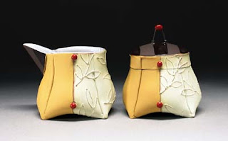
This cup is by Kristen Kieffer, one of my new favorite ceramicists! I absolutely love the decorative details she puts into all of her work. And The colors she uses are beautiful. This piece is a great example. I love the shape of this pitcher, the curved in body and the spout are so delicate. The pattern is also very lovely!

This is a really interesting piece by Kristen Kieffer. This one is hand built and has some very awesome darting technique! I love how the pattern moves with the piece. Overall there seems to be a lot of movement in the piece.

This piece by Holly Hatch is awesome! I love her decorative style. Her intricate hand painted details are lovely. I also love the way she presents her work, by hanging her pieces on the wall and having a frame around them. The aesthetics are very pleasing to the eye.

Another piece by Holly Hatch. It reminds me of an old antique chinese plate. The little waves and the line outlining the dent of the inside of the plate are really nice little touches. It makes me wonder if she is of asian decent. Lovely little piece!
Kayleigh Butenschoen-Assignment 1
Kayleigh Butenschoen
Assignment 1 Heads


Assignment 1 Heads

I think this head by Tip Toland is plain weird. The craftsmanship is really nice, and I love all of the wrinkles and the color of the head. I think the missing teeth added a really nice "goofiness" to the piece. It kind of reminds me of what Golem would have looked like before he went crazy! I also appreciate the veins in the neck. Overall, a really well done piece.
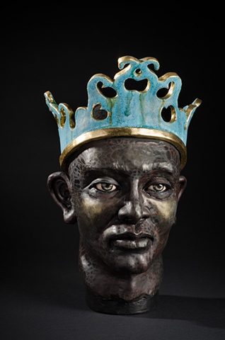
This piece by Jacob Foran is pretty stellar in my opinion. I love the contrast of the gold and bright blue again the textured black head. I think that the cold stare and the steely grey in the eyes really give it a coldness to the piece. I think that the texture in the face is beautiful. The crown is really interesting to, it makes me want to see the top of the head. I feel like there is something on the top that we are missing.

This piece by Judy Fox is interesting. It seems like a very traditional Korean or East Indian head. The details in the head piece makes me think more Korean. I like the old affect of the paint, I think it gives a nice "vintage" appeal to it. I also really appreciate the details in the head piece. I can't really see the hair in the back, but from what I can see in the front it doesn't seem right. It seems to bulky to be on this head.

This head by Tanya Batura really makes my skin crawl. The morphed neck and shoulder kind of make my stomach hurt. Probably because of the unnaturalness of it. The figure looks like it is melting, and the black adds to that affect, kind of like hardened lava or something. It is interesting that she made the figure glossy, it seems like it should be matte. Overall, interesting but disturbing piece!
Wednesday, April 18, 2012
Assignment 2 - Eating and Drinking Vessels
Allison Edmisten


Liz Zlot Summerfield
These really caught my eye because of their shape. The base, how the clay is folded, and the lines make them look like they are origami and made of paper. I also like the split in the middle, with two different textures and designs. It is very interesting and beautiful at the same time. It looks like the an intentional origami design, but maybe she even made them like someone would make origami, but with a thin slab of clay instead of paper.

Scott Jupiter
These mugs are quite interesting. They are done as a custom job to a client, who must have requested the spikes. It looks like the cup was spun and the handle and spikes were hand built to add to them. I notice that the handles seem huge, but maybe that is because they have to be pronounced, because they must be used. If someone chose not to use the handle they would get pricked by the spikes! I am not sure If I would want to use these cups, but it gives me a whole new light on possibilities or ways to manipulate the textures, or add details for a purpose or for aesthetics.

Claire Prenton
This is by far my favorite and I want to buy it! I love the wilderness concept of her work. The green earth tones, the wood, the leaves and things on the lid. I think this piece is interesting because of the base and all of the added detail. It looks like it is standing on a base made of branches... or are the branches made of clay? My guess, is that they are made of clay because it is so conforming to the piece and fits perfectly... almost impossible to find naturally. I could look at this for hours because it is so beautiful.

Claire Prenton
I chose another one of her pieces in the same collection because I am drawn to them. This one is different because it is a pitcher rather than a storage piece. I think the spout is very interesting, it is open but shaped and designed as a leaf. The concept of bringing in a theme to the work is a great idea. I also like the imprinting done on the sides. The base looks like a leaf was pressed into it, but it could easily be drawn on. The acorn and other details must have been drawn. I would like to know the step by step process of making these. This also looks like it was hand build rather than spun on the wheel. I like the bottom, because it is separate from the rest of the body, with the prominent boarder and line.
Assignment 1 - Ceramic Heads
Allison Edmisten


Helga Prosser
The thing I like most about this head is the incorporation of hair. The artist had several heads on her website with different styles of hair. This is a bit more stingy and not as natural looking as the others, but I think it is a great way to do it. She is also very realistic looking. I prefer the sculptures that are realistic rather than exaggerated, even though I appreciate both.

John Asaro
This head was quite striking to me because it is extremely realistic but also very abstract at the same time. No real person has such lines, but the features are created perfectly. I like how the lines enhance the features of the face, while changing them at the same time. It is a very interesting concept and not one that I have seen a lot in sculptures.

Screaming Man
This head was from an artist in the UK, but it did not list the name. The thing I like most is the incorporation of real objects to enhance the clay. The artist added jewelry, and it looks like some other material for the hair. It is also very cool how the tattoo was drawn on, but the the rest of the head is vary pale and still clay colored. I love the expressions and how the artist scrunched his face into a screaming man, with the squinted eyes and furrowed brow. There are many elements that play together for this head, and make it so great and interesting to look at.
Tuesday, April 17, 2012
Assignment 2 - Liz Woodard

I like this work by Holly Walker. This type of oval bowl is a nice diversion from the ordinary. Also the uneven tabs on the sides of it look nice because it also breaks the symmetry that you often see in most pieces.

I like these pieces made by Mark Pharis. These can work as plates and also still contain a little bit of liquid because of their curve. I also appreciate the unique shape that they are, not a circle or a square. The biggest thing I am impressed with is that all of the plates are pretty much exactly similar. I would find it difficult to make so many that looked so similar in every way.

I love this piece by Liz Zlot Summerfield! Her other pieces are great, but i really enjoy this piece because not only does it have her characteristic dots and glazing it also has additional script and a floral pattern. I like how on this piece she made it unique while still keeping her regular trademark designs.

This plate by Kristen Kieffer is interesting. I like her trademark look of the glazes that gives it an old fashioned look. One thing that I notice in this piece that is not in her other pieces is the strategic placing of the orange colored dots. It makes me wonder how she placed those there.
Subscribe to:
Posts (Atom)