ART 265 Intro to Ceramics
Goals: 1. Skill Based: To understand and create a relationship with clay and its different stages, i.e. wet, leather hard, bone dry, bisque, and glazed. And also learn some basic firing techniques 2. Visual: To enhance your awareness of form and surface in utilitarian and sculptural ceramics. 3. Conceptual: To build on your basic knowledge of historical and contemporary ceramics from around the world and begin personal research.
Sunday, September 25, 2016
How to post
So I don't know if anyone else is struggling with how to make a post like I was, but you click on the dashboard link and then the pen/pencil icon to start a new post!
Sunday, February 22, 2015
Cuppa what?
I love cups. It is an obsession. I have tons of cheesy tourist mugs, glasses, tumblers, starbucks cups, I even have little cups for espresso. As you can probably guess I am a bit excited for this assignment. I also love nature (and my horse) and all the places that we have been together. Nature and the colors in nature influence a lot of my style choices. When I clicked into access ceramics these mugs were the first ones I saw and I fell in love. How could you not? I love the colors, the shape, the design. I don't particularly enjoy handles on cups, so these are really perfect for me.
However, because part of the assignment is handles here are some more awesome cups that do indeed have handles. Both of these cups are by Simon Levin. I love the earthy tones and the "belly" shape of the cups. I also like the petite handle that looks like it would be great for one finger, but that it wouldn't be uncomfortable to hold in your hand. (Not finished until it's in the hand right?)
 |
| "Three Cups" Wheel Thrown by Kalika Bowlby |
I really hope to make some of those tall cups (the blueish greenish ones) and maybe a pair of the smaller belly shaped cups. Here are some haphazard cup ideas I drew.
cuuuups
So far these two designs are my favorite looks of cups. Since some of my friends drink tea a lot of the cups I make are most likely going to be formed to carry a decent ammount of tea. These two cups above were made by Bryce Brisco.The feet on these cups make it easier to set down along with the handle that looks like you can be held by 2 fingers based on the spacing and the size.
the tallness of these cups made by doug peltzman interest me with their tall shape and grooves that make it easier to grip the cups. they don't have handles so that also interests me.
since you see the pattern I like the simple designs of cups. If it can get full of a liquid, if I can drink out of it and it's easy to hold I will like the cup. I like the design of this old mayan cup with its simple design and colors.
my cup designs are very simple and easy to use. Im looking towards not having to trim the cups but if I have to then I can try and get it trimmed in time for the handles to be attatched to the body.
C U P S
I also found these cups on Access Ceramics, and they were made by Victoria Christen. I don't like the darker color scheme of these cups, but I really like the shape of them and the size of the handles. I want to do a similar style of cups to these, but maybe a bit taller and have a smooth outer layer, unlike these ones. I will also make them much brighter like the first cups.
I thought this was a very interesting handle for a cup, made by John Oles. I am not going to attempt making a handle like this, but I just thought I would put it in the post because I really appreciate his design, and wouldn't mind owning a cup like this one day.
For my cups, I want to have a practical and simple design. I want them to be like tall coffee mugs that people could use every morning with breakfast. They will have a lighter color scheme, with few details, and maybe some texture on the outside.
Thursday, February 19, 2015
Cup Assignment
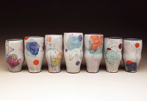
These cups were created by the artist Elaine Buss and can be found at http://accessceramics.org/results/object/2/ The cups made by Buss really intrigued me because of the unique shape of the cups. I like how the cups have the same shape, but vary in height. I also think the use of color and abstract shapes are very successful.
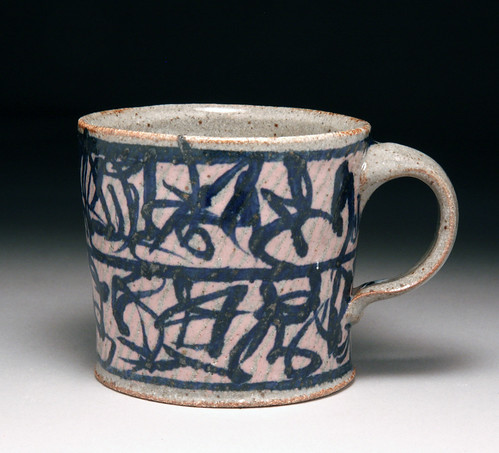
This piece was made by the artist Tom Hoffman and can be found at http://accessceramics.org/results/object/2/ I was interested in this cup because of the traditional handle shape with a thick top and thin bottom.The basic shape of the cup also inspired me to try and do a similar simple form of the cup and then add a design to the cup using colored slip and glaze.

The two artists inspired me to create these sketches of cup designs. I want to learn consistency through making the same basic shape cup and then adding a design with colored slip. I also want to attach a thick at top and thin at the bottom handle to the basic shape cups. In addition, I want to learn variation in size so I want to create cups that are wide at the bottom and curve back in, then curve out at the lip. I want to create these cups in different sizes.
Wednesday, February 18, 2015
Cups 'n Stuff
These mugs are by Chris Baskin and were thrown in 2007. There's a lot of aesthetic in these that could throw someone off when looking at them. The relationship between the cup and handle looks great at first glance but after you look for a while, you notice that the handle (while it is wide) is only half the height of the cup. It helps that the top is connected at the lip directly, it adds a big lift to the cup and makes it look bigger than it is. The hidden attachment with the handle helps slim it down and give more of an illusion of a lot of height.
This peice was dated back to the 8th century and was from the Mayan culture. Despite the height of it (8.5 inches), I want to make most of my cups this shape. i just feel like it holds more and seems fuller. I didn't realize how detailed and almost cartoonish ancient pottery could be. The artist style looks like a cheesy Sunday comic. ( http://www.metmuseum.org/toah/works-of-art/1999.484.2 )
These beach cups were made by Bethany Benson by throwing and altering in 2005. this is the first time I've seen this idea, to just put the cups straight in the sand. The utilitarian point of this is genius and the glaze on the outside in the shape of a butterfly only adds to the shape of these. They have a good balance between shape (holding it in the hand and creating grooves in the sand so it holds better) and the butterfly (using the wings as curves and the butt going down to the bottom). My only concern is the worry that sand will get kicked into it at some point but you could fix that with a lid easy peasy.
This peice was dated back to the 8th century and was from the Mayan culture. Despite the height of it (8.5 inches), I want to make most of my cups this shape. i just feel like it holds more and seems fuller. I didn't realize how detailed and almost cartoonish ancient pottery could be. The artist style looks like a cheesy Sunday comic. ( http://www.metmuseum.org/toah/works-of-art/1999.484.2 )
This "Monkey Cup" was found in the Netherlands and is dated back to the 15th century. The detail is just amazing on this, especialy with the metal work on the bottom. The foot of this is really interesting because i can't imagine the amount of work that went into shaping a non rounded foot when the peice is so tall and thin. Unless it was done in sections, which actually makes more sense now that I think about it. I really like the little triangle points that come out of the foot, they add a good balance between sharp and round.
I pretty much just want my mugs to be kinda tall and wide so they hold more liquid. i'm not very good at pulling straight vertically, my walls tend to pan out a lot so doing all these cups like this will give me good practice and control with my pulling. When I shape my handles, I think I'm going to build some cardboard tunnels to keep the shape of the pointed handles while they dry. Also, if you can't read the small section there it says, "all dishonest handles, no more than 1.5 inches wide".
Cup of Cheer
I really enjoy the the delicate shape and rim of the first cup, especially the implied two hand cradling it seems to demand. If a cup has to have a handle I really enjoy the soft ear like curve that the later two have and although the last one is not completely curved.
 the handle to this mug (I only know because I just checked out the mugs in my cupboard) is rather comfortable and honest. I also really enjoy the aesthetic and tactile quality of the sides.
 the handle to this mug (I only know because I just checked out the mugs in my cupboard) is rather comfortable and honest. I also really enjoy the aesthetic and tactile quality of the sides.
Assignment #4
This Japanese water jar is from the Edo period, estimated to be from 1720. It is classified as stoneware. I like the shape of the piece, how it has a slight belly. I took a liking to that shape in class during the demo today. The belly shape looks like it would be comfortable to hold, and a nice feeling cup is important to me. Although, when I make my cups, I would extend the rim/top of the cup to add some height so my piece wouldn't be as stout as this historical piece.
This cup and saucer is dated to be around 1760, and was made in Saint Petersburg, Russia for Empress Elizabeth Petrovna. This piece is porcelain, so I don't think I would have the skill to make something like this right now. What I like about this piece is that the cup has the "belly" element to it at the bottom, which I would like to replicate. As with the other piece, I would want to take a different approach with the top half of my cups. I want to make the belly shape, and then continue up for a little bit, straightening out for the rim of my pieces (the piece is a little too upright at the top for my taste.)
These pieces were made by Sanam Emami from accessceramics.org. They are porcelain (it seems all most of the pieces I chose for this post are porcelain), and were made in 2009. This is the shape I am going for in this assignment. The belly shape with a continuation (almost like a hill?)
These cups were handbuilt by Margaret Bohls. I also found this on accessceramics.org. I watched some of her videos on youtube and it was really cool to see how effortlessly she made her pieces. I like the shape of these cups, the belly shape I've been going on about. I think this would be the shape of cup I will be making for my assignment, even though I will be making my pieces on the wheel. As for the handle placement, I think I might try Bohls' placement and see if it's comfortable for me. If not, I would like to try placing the top of the handle maybe a quarter or half of an inch higher, so that my hand could fit better.
Cups:
http://accessceramics.org/results/object/2/
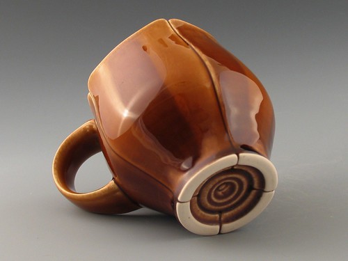
I love this coffee mug by Jeff Campana. The trimming on the foot is beautiful. I also like the belly shape of this mug. I would like to incorporate this type of shape into my pieces. I also will use a similar handle shape as well. I would love to have some cool trimming on the bottom like this one but will choose a simpler trimming style on mine.
http://accessceramics.org/results/object/2/
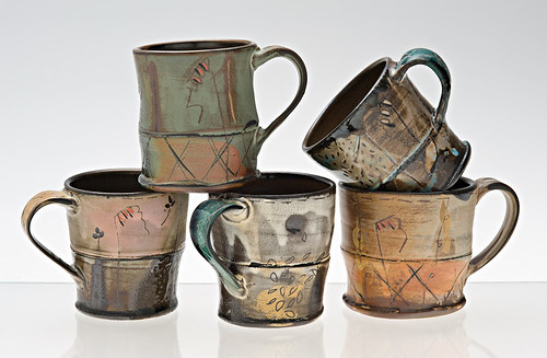
These mugs by Victoria Christen are awesome! I like the split in the middle of all the mugs and the shape of the cup on each different side of the mug. I think I will be able to incoporate a technique like this on my mug. The handle is elegant and also practical. I think I will do a handle more like the handles by Jeff Campana and mug shapes like these.
Drawings:
http://accessceramics.org/results/object/2/

I love this coffee mug by Jeff Campana. The trimming on the foot is beautiful. I also like the belly shape of this mug. I would like to incorporate this type of shape into my pieces. I also will use a similar handle shape as well. I would love to have some cool trimming on the bottom like this one but will choose a simpler trimming style on mine.
http://accessceramics.org/results/object/2/

These mugs by Victoria Christen are awesome! I like the split in the middle of all the mugs and the shape of the cup on each different side of the mug. I think I will be able to incoporate a technique like this on my mug. The handle is elegant and also practical. I think I will do a handle more like the handles by Jeff Campana and mug shapes like these.
Drawings:
Cups
Tuesday, February 10, 2015
Rhyton
These two photos are from the Google link we were given in the syllabus, I really like the horns on these ram rhytons, and the simple yet fascinating details on both. I also like the natural color the artist left on the rhyton above, it makes it look very authentic and beautiful, especially with those line details that show the indentation.
For my rhyton, I want to do a rhinoceros, and have the two horns as handles to grab. There will be small details, like wrinkles all over the mug and on the rhino.
Rhytons
I had a difficult time finding any rhytons on the sites provided in the syllabus
The design of this rhyton really stood out to me, Mostly due to the fact that instead of just a head of an animal its the front part. The attention to detail is really evident throughout the piece and I enjoy the stylization used on the antlers.
This rhyton is much more beat up than the prior one but you can still clearly see what it is supposed to be. I like how this rhyton has a handle rather than just being a baseless cup. The angle from which the cup is coming out of the dog's head is interesting and I like the lip on it.
For my first rhyton I'm going to make an Ethiopian Wolf
My other rhyton is going to be a female Eld's Deer
Monday, February 9, 2015
Asignment 3- The Rhytons
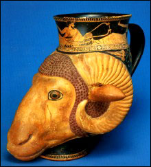
This piece was titled "Athenian rhyton Museo di archeologia ligure" and the artist is Genova. The link to find this picture is: http://www.iranchamber.com/history/articles/persian_influence_on_greece2.php#sthash.0mNwux94.dpuf
This rhyton cup interested me because unlike the other images of the cups were not sitting upright like this ram. I was also intrigued by the gold slip images around the top f the cup.
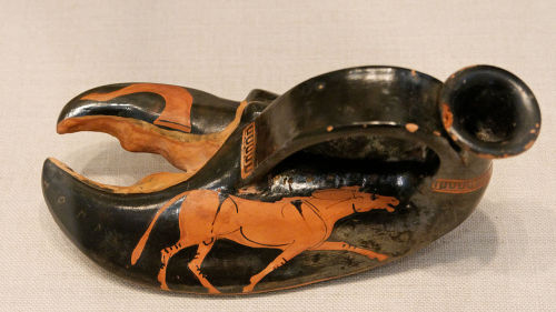
I found this image from the Google search page which led me to the tumblr page of Greek Rhyton. Unfortunately, the name of the artist is not listed but you can find the image at:
https://www.tumblr.com/search/greek%20rhyton
I was interested in this piece because instead of using an animals head for the cup, this artist used a claw with a unique handle placement and opening for the cup.

The designs I found inspired me to draw these two designs. I want to make a horse hoof cup the is usable with a handle on each side. I also want to make a giraffe head cup that is usable with one handle. I will use different colored slips like black and brown to help render my designs.
Assignment 3 | Kirsten Cox
My thought behind choosing a cow and a deer is the organic and quality foods trend. The increasing urge to be aware of what we are consuming and to increase the quality makes the cow and deer a perfect choice.
 |
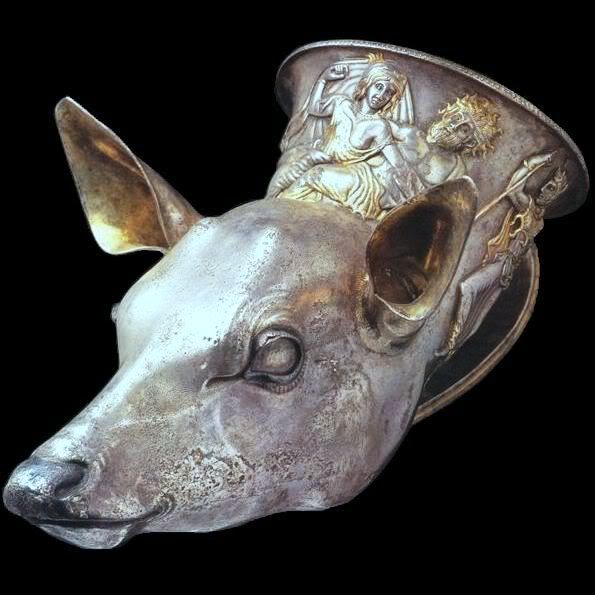 |
| Fawn | http://s238.photobucket.com/user/elixir86/media/rhyton_trieste.jpg.html |
Rhytons- Laura
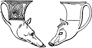 what I really like about this rhyton is how well the shape of the cup flows with the head on the animal almost looking like it the neck of the animal. I also like how the handle of the rhyton is long and almost looks like the ear of the animal.
Look at all dem rhytons
I was looking at the rhytons and all the animals in the google results you provided and to be honest, I didn't want to do any four legged animals. It seemed a little over done to me. Also I was looking at an endangered species list online and thought it'd be pretty cool to go a different direction and make rhytons with birds. As for my historical example, I included one of the few bird rhytons I found that I think was dated to 480 BC. I'm going to use the shape and format as inspiration for my kiwi bird rhyton but without the support clay underneath since a kiwi bird is a ball of fluff on it's own so it'll be plenty supported. I really like how it all fits together, it doesnt look awkward and the bird looks very regal. it's standing straight up which I find to look a little better than the rhytons that are at an angle.
I included this rhyton simply to show the shape of the macaw rhyton I'm going to do. I'll probably make more of a bend between the cup and the head for added stability.
P.S. I used the google results for both images.
These are my sketches. I chose birds because I didn't want to do any four legged animals and fish would've been kind of difficult. I had recently done a watercolor close up of a macaw and since then, I've really liked them. I haven't decided if I want to do slip work on it because (1) the black slip on my first assignment didn't turn out to be black and (2) a straight terracotta color macaw would look cool, especially around the eye. Also, I chose the kiwi bird because I saw a youtube animation of a kiwi bird that dreamed of of flying it's whole life (it's flightless) and to acheive that dream, it jumped off a cliff to it's death so it could feel like it's flying and die happy. My heart hurt, it was so sad and cute. Going along with the bird theme, I chose the kiwi, another endangered species of New Zealand. I don't think I'm going to make the heads themselves hollow because if I plan on using them, I don't want to worry about cleaning all the nooks and crannies of the heads. The only thing I'm kind of apprehensive about is the strength of the kiwi bird's beak. I might have to make it slightly thicker than it should be to ensure it won't break off over time.
Subscribe to:
Posts (Atom)


.jpg)


.JPG)


