Friday, June 8, 2012

Have you met the Potter Bee?

While taking this class I was privileged to watch a Potter Bee build a new clay nest from the ground up. Or, in this case, the ceiling down. I have seen these nests around but never really thought about how they were hand built with great precision by bees. More on the Potter Bee.


And here are some photos that I took as the project progressed. Here you can see the Potter Bee working to build the center. I noticed he uses this to hang from while building. Probably uses it to sleep on, as well? Look at that skill!


When he moves to the edge and works the sides, he makes a perfect circle. He braces himself on the center while slowly adding and patting the clay into place.


He has finished the first layer and is adding a second layer of insulation, or maybe for his young? Bees are endangered and all must be protected. Throw away your bug spray and rat poisons! Throw out your chemicals and GO GREEN. Don't use Fabric Softener. Educate yourself on the chemicals that have permeated our daily lives and rid yourselves of them.


At last the hovel is complete. The clay turns from brown to gray. Fascinating.


I wish you all the best in your future endeavors.

Thursday, June 7, 2012

I really like these peaces because of the way Simon Fell uses several peaces of clay to create one form. I also like the textures he uses and how each one almost forms the part of the head that should be there.

Eating Vessels


I Like this peace by Deborah Britt because of the way it leans back towards the handle and the gold color glaze that Britt used.

Bowls

This bowl by Ann Truemper caught my eye because of the way she made the lip. I always have trouble trying to making my lip perfectly flat. Ann just used the "wobble" of the lip and incorporated it into the peace. I really like the flat black too.

Wednesday, June 6, 2012

Assignment 1 Heads


I found this head and it stuck out to me for a couple reasons. I find this head simple but its characteristics are not sticking out awkwardly. I struggled with making the facial features look natural and had to trash my first few attempts because the lips and nose stuck out unnaturally. My big issue was the ears and this piece has proportionate ears and the way this piece was painted accentuates the natural facial features. I love the folds and creases in what would be his skin because as simple looking as this is, it looks almost real.

Monday, June 4, 2012

Assignment 4: Contemporary Bowls

Troy Lynn Hamzy

Here are a couple of styles that caught my eye today.

From Fuji Arts
This bowl reminds me of the style of the 1950s. Just clean, simple, yet not hard or cold. Nice curves and color.


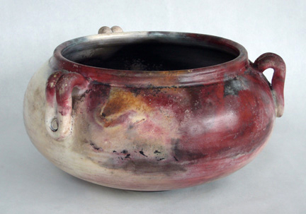
This is a pit-fired bowl by Colleen O'Sullivan, NY 2007. Found on the http://www.jayneshatzpottery.com/WOMEN.html page.

Assignment 3: Ancient Bowls

Troy Lynn Hamzy

Googling "Ancient Ceramic Bowls" will bring up some interesting objects. I have copied information from their respective Web sites and pasted it below each photo. Needless to say I am attracted to them.

Ancient Egyptian Bowl - Lotuses


Found at Abydos, Tomb F 15, this bowl dates from the joint reign of Hatshepsut and Thutmose III, between 1479 and 1458 BCE. It is made of Egyptian paste, with the design being incised while wet and most likely brought out with ink after firing. Quite lovely bowls such as this were made in the New Kingdom, as well as many other objects made of the turquoise blue Egyptian paste. The interior of this bowl shows closed lotus blossoms extending from a central pool, with fish swimming between them. Bowls such as this were used as votive objects in tombs, temples, and shrines, especially those dedicated to Hathor (the goddess of love, motherhood and joy). Image Courtesy of Kallie Szczepanski, About.com Guide to Asian History. More...


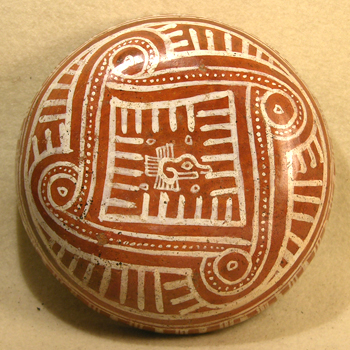
Mixtec Painted Bowl

Mexico 1200 AD - 1500 AD Beautiful Mixtec shallow bowl from the post-classic period. Exterior is very nicely painted in bright white on red ground. Circles, lines and dots create a repeating serpent pattern around a central stylized avian image. Overall design is a representation of Quetzalcoatl (the feathered serpent), one of Mesoamerica's most important deities. The interior is a soft orange-tan with a white and red stripe at the rim. A few minor dings and scraps remain. An unusually fine example and a rare form. Nice manganese deposits. Approx 6.25" across x 1.75" tall. More...

Assignment 2: Eating & Drinking Vessels

Troy Lynn Hamzy

Found the following 6-finger cup on the Griffindyeworks.com web site. This interesting vessel is part of the "Two Hearts-Entwined Pottery Collection"


On the lighter side, from Fuse-Works.com Julia Whitney Barnes web site:

Sunday, June 3, 2012

Heather Clerf's Assignment 4- Contemporary Bowls

 Masayoshi Oya - Untitle
These bowls look like they were cast out of metal. I love the way the mangan glaze changes the appearance of the stoneware and gives it a shiny, metalic quality. The presentation of the bowls is also really cool with the shapes scratched into the sand like a zen garden.
 Hayne Bayless - Bowls
These bowls caught my eye. The inverted shapes and colors create an odd balance along the darted corners. Square bowls always kind of baffle me because when I think of a bowl, it is always round. I enjoy looking at them, but find the practicality minimal. I like that these pieces also combine lines and curves in a different way than is normally expected, with the top edges curved upward instead of outward and the lines going up the sides instead of being curved.
Linda Arbuckle - Bowl: Red Notched Orange Center
This bowl by Linda Arbuckle used majolica, but the color has a much different, sharper feel to it than the historic bowls I posted about. I thought it was interested also, that his piece was made of terra cotta instead of the stoneware or porcelain I normally think of for dishes. The notched edges work well with the painted design she used and they create another layer to the bowl's appearance.

Heather Clerf's Assignment 3-Historic Bowls

 I liked this footed bowl from the 1530s titled "Childbirth". The maiolica created beautiful colors in the imagery. I couldn't tell very well, but it looks like the bowl has a double rim, which I think is neat. I thought about trying to do a bowl with a double rim, but felt a little rushed to get all 50 done. I began playing with my shapes more toward the end, but was a little daunted by the double rim. I also really like the hollowed-out, tall foot on this bowl. Below is another view of the same bowl.
 I like the shape of these "Monochrome" bowls from the 1st century A.D. I did a double-take when I saw that these bowls were less than 2 inches tall and three inches in diameter, but it looks like they are there as representations of Roman style glassware. The gentle and smooth curve of the bowls is really nice.


 Here's another piece with maiolica. I'm not much of a painter, but if I'm able to take anymore ceramics classes I would like to work with some. Not only does the form of the bowl itself talk about its history, but the artwork and the details included tell us so much about what was valued and considered art.
I really like this Japanese temmoku tea bowl's glaze. The shape is different that what I am used to seeing and what I worked toward when creating my own bowls, but I can see the utility in it. The glaze's iridescent quality is one that I really enjoy and it also has a earthy feel with the separated "hare's fur" lines.  

Saturday, June 2, 2012

Heather Clerf's Assignment 2

This piece by John Gill was one of few of his that I enjoyed looking at. I'm not a big fan of how abstract his pieces are, but I kind of liked this one. I like how it's bigger and comes out at points at the bottom.
Here's another one by John Gill. The mixed convex and concave angles make it really interesting to look at, and I like the more muted colors of this piece. I like that he was able to work the shapes together so cleanly.
This poster came up when I searched one of the artist's names. The tall white piece really caught my eye with all of its curves and how it almost looks braided. And it still looks functional!

Of the artists listed for the assignment, I most enjoyed Kristen Keiffer's work. I really like the ornate detailing on all of her pieces and how they look simple and elegant despite all the designs. Here are two pieces of hers that caught my eye. There were many pieces with a lot more intricate darting and detailing, but I like how simple and beautiful these two are.