Sunday, May 19, 2013

Blog 6


The first historic cup that I really like is the Cylindrical Vessel with Throne Scene from the 8th century from Guatemala. What I like about this cup is the simplicity with the shape of it and the size. The shape was a nice cylinder shape and the size was the right size for a cup. I also like that the painted scenes serve as historic documents. 


The second historic cup that I really like is the Skyphos deep drinking cup. I like the symbolism depicted on the cup with the warriors indicating the different environment and the breastplate and helmet representing characteristic equipments of the warriors. Also, I like how there are two handles position closed to top of the lip and on opposite sides of the cup.


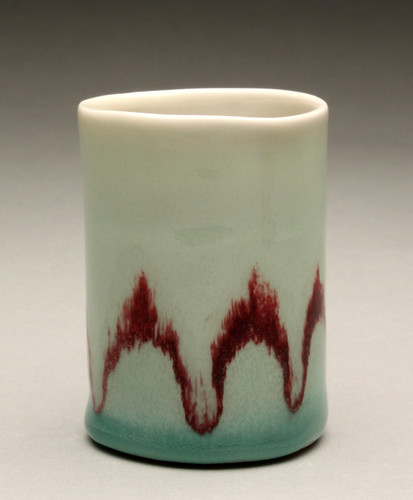
The first contemporary cup that I really like is Nicholas Bivins’ cups. I like the modern futuristic look and shape of the cups. The simple line design and color used on the cups give it that modern futuristic look. Also, the outward shape of the feet and the rectangular shape handles adds to the modern futuristic look.


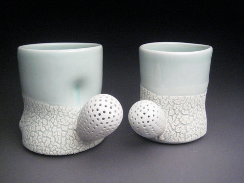
The second contemporary cup that I really like is Elizabeth Robinson’s mug. I like that it’s the right size for a mug. I like how the handle is positioned closer to the top. Also, I like the color and designs used on the mug.


Friday, May 17, 2013

Blog #6


Doug Peltzman
I really like his cups, they are just really cute. He has these kind of unusual handles for his mugs and he's painted or glazed them so bright and fun looking.


Clary Lllian
I love her mug, it is so cute and small. I like that the lip looks slightly wobbly and the handle can only fit a finger. I also love love love the color she's glazed it.


I chose this cup because of how intricate the drawing on it is. I also like that is isn't a mug, it is just a cup. I don't know why you'd need a cup with that much detail on it, but it's really cool.


I like this cup because there is a crazy intricate drawing on it and the handles are kind of strange. It is almost like a pot instead of a cup, but I like it.

Blog #5


I really enjoy this box, the detail carved into it is amazing. I also really like the clasp for it and that it is a box for a pen.


I really like the design on this box. I like that it is a black or dark color and has all of these bright details to it.


Tom Hoffman
I like this box because it is an unusual shape which really made it pop out for me. I also love the design on the box, how it is very symmetrical with the dark and the light and how he's got the texture added with the paint.


Careen Stoll
I liked this one becasue it is the only one I saw that was a round box, which you don't see very often. I like that it looks sort of like a ball of clay that she just pinched and hollowed it out, but I know it isn't that easy. I also like that she painted the seam of the closure a different color to kind of break things up. 


Blog #4


I chose these bowls because I thought it was so cute that the bowls actually had little feet. I also really like the color of the bowls.


I really like these bowls because of the design that was carved into them and the bright colors! I also like that they have taller feet than some of bowls I saw. 


I really like this bowl. I think the rabbits are just too cute. I also like the texture they added on the sides of the bowl. I like that it is also asymmetrical.


I like this bowl because of how simple it is, yet its got this almost hidden texture to it. I like that the colors are earthy and that the foot of the bowl is very small.


Blog #3


I liked Mark Pharis' work because I really enjoyed the shape of his plates and the paint job is also very interesting. I like how it looks kind of tribal.


I picked Mary Barringer because of the texture she put on her objects, it makes the dish so much more interesting with those textures scraped into the clay. Her muted color choices were also very enjoyable to me.


I picked Kristen Keifer because I really liked the color choice she made for this piece, I also think the shape of the piece is very strange, but nice. The intricate detail craved in is pretty cool too.


I really enjoyed Tara Wilson's stuff. I enjoyed her color choices, the unique shapes and the textures she created with those colors, but how it is actually vert smooth looking. I just really enjoyed her work.

Tuesday, May 14, 2013

Cup or Tea post 6

I really love this Beaker.  The enamel painting is very detailed and I love how intricate it is.  I love the foot of the beaker.  The foot has great texture detail.  Over all this piece is really cool, and the enamel on the beaker is very different from what is normally seen.
This pouring vessel is so elaborate and I absolutely LOVE the handle.  I like how it is a different material and the I like looking at the placement of the handle and how the vessel has a very distinct top. It is and Ivory Vessel and that is very distinct to the vessel.
This cup is so cool.  I love the shape, and the placement of the handle.  I love how the shape is different then what we normally see.  I love the earthy tone of the glaze and the effect the artist was able to achieve with this cup. I have noticed the foot of this cup is more a "tea" size it is a smaller foot and just what I have noticed when looking at these cups.
I think these cups are so cool. I love how they are pleasing to the eye and the multiple techniques that were used to achieve these cups.  I like seeing how the artist did effects on the cups that would make them more functional and easier to use.  I like how the handle is pierced and I really enjoy the crackle effect on the bottom.  Even though the cups are in very sterile and mostly white/light blue base I love the play with texture.

Blog VI


What an elaborate beaker! I think my favorite element of this, is the gray colors contrasted with the gold. I also really like how the bottom of this piece is shaped like a three-leafed clover. According to the article, this beaker was most likely used in the Burgundian court. This is indeed a princely piece. The story of the folly of man behind it serves to make it even more fascinating.


I love, love, love this tankard! I do not know why, but I have always found beer tankards wonderful to look at. Perhaps it is my German ancestry. Ivory is always a nice look, and the silver-gilt handle is aesthetically pleasing, if not entirely practical. I would love to have a piece like this on display.


I cannot describe how much I love this piece! The simplicity of it is delightful. The combination of smooth lines with its gray-white color is magnificent. I would love a set of these cups in my dish collection.


Again, another very simple piece. I am attracted to clean lines and light colors, so this cup is great. The title, "Copper Musings" is interesting and applies well to the design, I believe. A very earthy, neutral cup that would go well nearly anywhere. The rusty red and turquoise play off of each other in a pleasing manner.

~ Ariella Hillger

Blog V


This box blew my mind when I saw just how intricate and detailed it is. It contains several different levels and more boxes inside of itself. The gold leaf and exquisite symbolic animals add elegance and beauty. The tiny legs are perfectly delicate and yet hold the whole box up. Truly a masterful piece of art.


I liked this incense burner as soon as I saw it. It would be a lovely piece to have in a home. I really appreciate the crackled glaze, giving it a dainty and pretty appearance. The gold metal cover is gorgeous, and I like the idea of flowers from all four seasons. The black lines on the edges are a good element of the piece.


This piece immediately stood out to me, as I am attracted to nature, and it reminds me of a stone or turtle's shell. I like the way the lid and bottom meet, as well as the earthy tones used to color this box. It would make a great container for jewelry or coins.


The very name of this box ('Crinkle') is pleasant. I love how the lid is sunken below the lip of the bottom. This gives it a look unique from many other boxes. Green is one of my favorite colors, so this pale sea foam shade is lovely, especially how some sections are darker and there are white lines throughout. A fun little ceramic piece.

~ Ariella Hillger

Tuesday, May 7, 2013

Assignment #5 The Box

I am in love with this pen box.  I find the shape to be very pleasing to my eye.  I like how it has inlays on the box. I enjoyed reading how this box has a very simplistic structure and reminds me of the simple ways in which we can construct such beautiful pieces.
This incense box is very detailed and elaborate.  I like how the box has the small curved legs and I find it so interesting how the gold leaf and mother of pearl inlays can be added to these boxes.  I liked learning about this box and seeing how much effort was put into making this elaborate piece.
I am truly in awe over this covered box and tray.  It is so detailed and I love how the glaze brings that out.  It is so simple yet has the detail that brings out the great craftsmanship in the piece.  I know this sounds silly, but I think it is so darn cute.  I love seeing the technique of adding the pulled handle on the top and the small handles on the corners.
I am truly digging these hexagonal slab built boxes.  They just are really standing out to me and I just think of the variety of ways in which I could use them. I love that they are simple and can be used for many reasons, from in the kitchen as storage containers, to the living room for decoration. I just really enjoy simple pieces, with the earthy glaze that was added.

Sunday, May 5, 2013

Blog 5 - The Box


The first historic box that I really like is the Central watchtower from the Eastern Han dynasty in China. I love the architectural features of the piece with the overhanging tile roofs, exterior staircase, and screen and open windows. Also, the height at 41 inches is incredible.


The second historic box that I really like is the Incense box (kogo) in the form of a plum flower from the Edo period. I like the unique shape of it – not only the flower shape that makes up the walls on the side but the dip in the form that the lid takes as well. Also, I like how asymmetrical the top part is with the bottom part.


The first contemporary box that I really like is the Three-Tier Stacking Box. I like the interesting shape, the nice color and texture on the surface of the piece. I also like how starting with the bottom part of piece and going up the piece, the height of each part of the piece gets shorter.


The second contemporary box that I really like is the Squished Box. I like how it’s not a normal looking shape box but a more circular shape. I also like how two sides of the lid portion are pinched in so it’s easy to pick up the lid. With the pinched in sides on the lid portion, shape of the box, color, and texture of the box looks like real like I could touch it and feel it as well. 

Blog 3 (Roll It Fold It Dart It)


The first contemporary ceramic artist that I really like is John Gill because of his use of bright and bold colors as seen in one of his pieces above. I think the bright and bold colors really work well together. Also, the oddity of the shape of the pieces is interesting.


The second contemporary ceramic artist that I really like is Mark Pharis because of his use of bright and bold colors and oddity of the shape of the pieces, just like John Gill. As seen above in one of his pieces, the bright and bold colors and shape is interesting and works well together.


The third contemporary ceramic artist that I really like is Tara Wilson because of the shapes that she creates with her pieces, the colors she uses on them, and the texture displayed in various places on the pieces. I also see some sort of functionality with each of her pieces.


The fourth contemporary ceramic artist that I really like is Kristen Kieffer because of the femininity in her pieces and that it’s not overpowering in terms of displaying it. The curving shape in the body of the pieces and the handles with the curving line decorations surrounding the pieces display femininity. The not overpowering in terms of displaying it can be seen in the color and the fact that the shapes weren't that feminine.