
Thursday, December 6, 2012
Heads
Slab/totems

Bowls

These 2 bowls by Cresek Studios have very interesting lips. I like the bumps created and the use of different glazes on them to make them really stand out. This would be interesting to try and I wish I would have in a few of my bowls.
Wednesday, November 28, 2012
bowls
Deborah Schwartzkopf Thrown on the wheel and hand built Elegantly done with the Ivory glaze and a touch of color. the shape makes me think of a gravy dish but turly id love to have soup out of one.
(2).jpg)
http://artaxis.org/ceramics/shaw_andy/andy_shaw/bowls(2)(2).jpg
The bright white are just the begining of the brilliance of this set the texture in the structual lines on the outside of these bowls adds all the class with a modern style.

Kristen Kieffer These stamped bowls with earth tones look almost like the came from India or Persia. I would very much like to try more in the way of stamps.
The bright white are just the begining of the brilliance of this set the texture in the structual lines on the outside of these bowls adds all the class with a modern style.
Kristen Kieffer These stamped bowls with earth tones look almost like the came from India or Persia. I would very much like to try more in the way of stamps.
Monday, November 19, 2012
bowls...


Saturday, November 17, 2012
Assignment 3
Historic and contemporary bowls
 Tenth-century (Five dynasties) green ware bowl and stand carved with
lotus petals, unearthed at the Huqiu Pagoda in Suzhou.
Tenth-century (Five dynasties) green ware bowl and stand carved with
lotus petals, unearthed at the Huqiu Pagoda in Suzhou.
I really like the detail that was put into this bowl and the outside thinking that when into it's uniqueness.
 Aztec Bowl.
I find this bowl interesting because of all the detail that went into either the inlay or glaze.
Contemporary
 This is a Portuguese bowl. I really like the simpleness to it but yet the unique design.

I really like the detail that was put into this bowl and the outside thinking that when into it's uniqueness.
I find this bowl interesting because of all the detail that went into either the inlay or glaze.
Contemporary
Wednesday, November 7, 2012
Historic & Contemporary bowls
Historic


Contemporary


Amanda Bury-Assignment 3 Post
Historic:

Tea bowl, ca. 1575
Tanaka Chôjirô (?), (Japanese, 1516–?1592)
Japan
Rough clay covered with a dull black glaze;
Tanaka Chôjirô (?), (Japanese, 1516–?1592)
Japan
Rough clay covered with a dull black glaze;
three spur marks of iron supports (Raku ware)
-This piece is hand built not thrown, I found its old and rustic look and its uneven rim, looking almost purpose-full to be very interesting.

Monochrome bowls, 1st century A.D.
Roman; From Syria
Opaque cast glass
Roman; From Syria
Opaque cast glass
-These pieces are glass not clay although they look very deceiving. I liked that they were all different sizes but held the same basic curve, foot and lip shape, this makes them look like a set.
Contemporary:

Kristen Kieffer / Small stamped bowls, stack
Title: Small stamped bowls, stack
Artist: Kristen Kieffer
Date: 2009
Technique: Thrown & Altered
Title: Small stamped bowls, stack
Artist: Kristen Kieffer
Date: 2009
Technique: Thrown & Altered
-I REALLY like Kristen Kieffers stamping on these bowls. I was a little adverse to do any sort of slip work, or altering of any sort this first bowl assignment, however, i think after seeing this i would like to try and do some stamp work with the next assignment of 25 bowls.

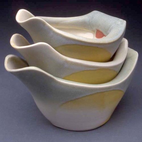
Deborah Schwartzkopf / Pouring Bowls
Title: Pouring Bowls
Series Title:
Artist: Deborah Schwartzkopf
Date: 2012
Technique: Wheel Thrown and Handbuilt
Title: Pouring Bowls
Series Title:
Artist: Deborah Schwartzkopf
Date: 2012
Technique: Wheel Thrown and Handbuilt
-These pieces threw me off a little bit, i just thought why would you wheel throw these in the first place? Why not just hand build them. However i suppose for the sheer fact of time efficiency and evenness of curves and thickness wheel throwing the bottom half of these then handbuilding the top part would work best. I just found these interesting, i did also find myself asking why one would need 3 pouring bowls. Seems like a lot of gravy to me. =P
Wednesday, October 24, 2012
gunmetal glaze

tea cup of Kristen Kieffer


Mark Pharis post number 2

http://www.harveymeadows.com/exhibitions/gill/gill/thumbnails/John%20Gill%20Platter%206_t.jpg
I really have appreciated John Gill's Art work! I like how he shaped the mold of the Plate and had it add more to his design.
- Jacqueline Musser
I really have appreciated John Gill's Art work! I like how he shaped the mold of the Plate and had it add more to his design.
- Jacqueline Musser
Kristen kieffer cups by Victoria Shamrell
In these cups I love the way that Kristen Kieffer decorates them. Each of her cups are different but yet look cohesive. The way she uses different imagery like the rabbit or the flower make the cups stand out. But not just the main images are what makes these cups so great the little details she put into them is what makes them great. On each of the cups are little veins that branch out and they seem like a trademark on a lot of her work. The handles on the cups are amazing to, she put so much time and effort to carefully sculpt them and make them look beautiful. Besides looking beautiful they look strong and able to fully support that teacup when it has tea in it. At least in two of the cups it seems she like using pastel color rather then just the plain colors.

Tara Wilson
I like Tara Wilson's cups because the shape of them seems similar to what I was trying to do, originally with this project. I first wanted to make cups that fit to my hand, or were molded to a hand, rather than the traditional, straight edged cup. The way that these cups curve in at the middle, where a persons hand would rest, looks like a comfortable shape to hold. Also the overall shape of the cups is very pleasing to the eye, they are not bottom-heavy, there is lift between the bottom of the cup and the surface that it sits on. The cups are also very aesthetically pleasing because of the curves and soft edges. There are hardly any, sharp angles, so the cup looks comfortable to hold and look at.
Subscribe to:
Comments (Atom)