Tuesday, May 7, 2013

Assignment #5 The Box

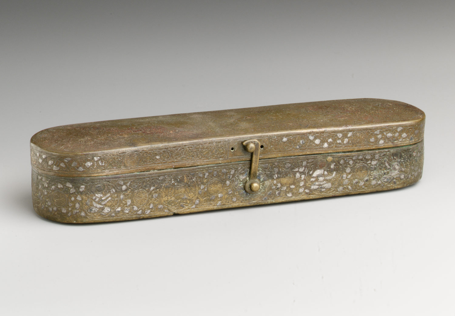
I am in love with this pen box.  I find the shape to be very pleasing to my eye.  I like how it has inlays on the box. I enjoyed reading how this box has a very simplistic structure and reminds me of the simple ways in which we can construct such beautiful pieces.
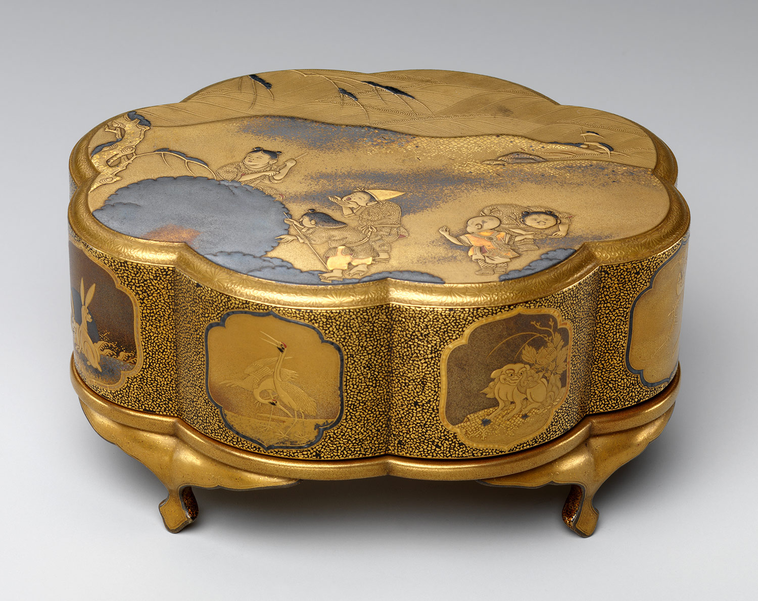
This incense box is very detailed and elaborate.  I like how the box has the small curved legs and I find it so interesting how the gold leaf and mother of pearl inlays can be added to these boxes.  I liked learning about this box and seeing how much effort was put into making this elaborate piece.
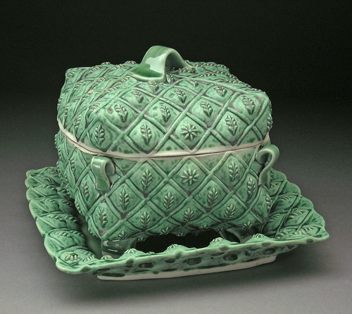
I am truly in awe over this covered box and tray.  It is so detailed and I love how the glaze brings that out.  It is so simple yet has the detail that brings out the great craftsmanship in the piece.  I know this sounds silly, but I think it is so darn cute.  I love seeing the technique of adding the pulled handle on the top and the small handles on the corners.
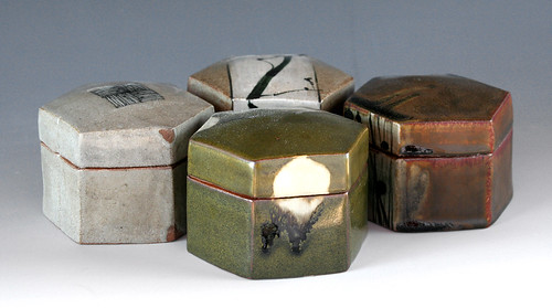
I am truly digging these hexagonal slab built boxes.  They just are really standing out to me and I just think of the variety of ways in which I could use them. I love that they are simple and can be used for many reasons, from in the kitchen as storage containers, to the living room for decoration. I just really enjoy simple pieces, with the earthy glaze that was added.

Sunday, May 5, 2013

Blog 5 - The Box


The first historic box that I really like is the Central watchtower from the Eastern Han dynasty in China. I love the architectural features of the piece with the overhanging tile roofs, exterior staircase, and screen and open windows. Also, the height at 41 inches is incredible.


The second historic box that I really like is the Incense box (kogo) in the form of a plum flower from the Edo period. I like the unique shape of it – not only the flower shape that makes up the walls on the side but the dip in the form that the lid takes as well. Also, I like how asymmetrical the top part is with the bottom part.


The first contemporary box that I really like is the Three-Tier Stacking Box. I like the interesting shape, the nice color and texture on the surface of the piece. I also like how starting with the bottom part of piece and going up the piece, the height of each part of the piece gets shorter.


The second contemporary box that I really like is the Squished Box. I like how it’s not a normal looking shape box but a more circular shape. I also like how two sides of the lid portion are pinched in so it’s easy to pick up the lid. With the pinched in sides on the lid portion, shape of the box, color, and texture of the box looks like real like I could touch it and feel it as well. 

Blog 3 (Roll It Fold It Dart It)


The first contemporary ceramic artist that I really like is John Gill because of his use of bright and bold colors as seen in one of his pieces above. I think the bright and bold colors really work well together. Also, the oddity of the shape of the pieces is interesting.


The second contemporary ceramic artist that I really like is Mark Pharis because of his use of bright and bold colors and oddity of the shape of the pieces, just like John Gill. As seen above in one of his pieces, the bright and bold colors and shape is interesting and works well together.


The third contemporary ceramic artist that I really like is Tara Wilson because of the shapes that she creates with her pieces, the colors she uses on them, and the texture displayed in various places on the pieces. I also see some sort of functionality with each of her pieces.


The fourth contemporary ceramic artist that I really like is Kristen Kieffer because of the femininity in her pieces and that it’s not overpowering in terms of displaying it. The curving shape in the body of the pieces and the handles with the curving line decorations surrounding the pieces display femininity. The not overpowering in terms of displaying it can be seen in the color and the fact that the shapes weren't that feminine.

Saturday, April 27, 2013

blog 5 Ariel Connor


This is a lovely box. I could so use this to keep incense in. Normally Im not a fan of gold but the silver inlay and the aged coloring make it look amazing and refined.

Oh dear god, this is so garish. Why would anyone build this? There is no possible design scheme that this would coincide with. Guess Im more for subtlety sometimes.

Ok this just seems exceedingly stereo typical. I dont like the curvature or the design. Oddly enough I do like the coloring.

This I love for the fact it combines both neat and messy art styles. Also the shape is simple and the coloring neutral enough that it could go with almost any style decor.

blog 4 Ariel Connor


I like this deign. It reminds me of a corset crossed with a sea shell. Though I mightve changed the color to maybe a purple or green. Then again I am partial to those colors.


I love this pitcher. Seriously, I wish I had this at my house. The patterning on the side almost looks like the surf hitting the sand.
 
This one makes me cringe. The color scheme is so off putting to me and makes me uncomfortable. I dont really know why, The design is nice but i just cant get past the color scheme.


Again, a nice design but Im not a fan of the coloring. Going back to my dislike of vertical stripes. Though the shape itself is quite lovely.

blog 3 ariel connor


I like this one for the fact that the rabbits seem to have taken some time to etch out. It almost looks like two halves of a bowl stuck together. Though the holes at the bottom kind of take away from it a touch.


The glaze on this one is awesome. Im always a fan of earthy pieces. Though the denting in the sides add to it Im not sure I like the uneven lip on it.


I love the top on this one but the stripes dont work to well in my opinion. Then again Ive never been a fan of stripes so I guess thats a personal bias. Id also like it better if the white part was black or dark brown.
Kristen  Kieffer: Small stamped bowls, stack
These I love whole heartedly. the leaf colors add to the imprints. I wish I had the skill to do something this intricate.

Friday, April 26, 2013

Sarah H. #5 - The Box

 I chose this box primarily because I love the idea of having multiple levels to the container. At first I didn't like the shape of the box, but then it started looking like legs with little feet and I thought it was cute. And then I saw some sophistication in it that I hadn't appreciated at first.
 I chose this piece because I loved the shape of it the second I saw it. It's got lovely curves that flow into charming corners. I also love the white edge along the top, I think it's a really cool effect.
 I picked this box because I love the mixed material in the use of the metal lid. I also like how stable it looks while also being very ornate and delicate.
I can't really describe EXACTLY what I like about this box, but it was the first one I picked. I really like the clasp. And I also really like the shape, the long skinny rectangle with rounded edges. It is a pen case, which appeals to me because I happen to love pens.

Sarah H. #3 - Roll it, Fold it, Dart it

 I liked this piece because it really shows the kind of geometry that hand building can give you as opposed to throwing. I love how wide-set it is and the angular seems.
 I liked this piece because of the overall aesthetic of it - color, design, shape. I'm not really sure, but I'm guessing this was made by darting at the bottom to bring it in.
 I love love loved this pitcher as soon as I saw it. The shape makes me think of a waddling duck, but in an elegant way - not in any way silly. I also like the shape and placement of the handle. I would definitely use this ever day at home if I owned it.
This piece appealed to me because it was so different from the rest of those shown. It's got an antique feel but it also seems very youthful. The corset type waist that I'm guessing was darted has a really cool effect and I dig the two handles but the four feet.

Wednesday, April 24, 2013

BLOG POST 6 : Coffee or Tea


The Beaker "Monkey Cup" from South Netherlandish in the 1400's has such intricate details! WOW!! I love the silver and black. Fit for a king!! It looks like it could have been used as the goblet in the Bible. From lip to foot, this goblet was fully thought out.


Chug!! Dionysus, the God of Wine would have loved the Skyphos deep drinking cup. I love Greek illustrative work that tells a story and the handles. The warm colors are offset nicely by the black background. The foot is very defined.


Bethany Benson should receive an award for literally the coolest set of pitchers and cups ever created by mankind. These are amazing!!! LOVE the subdued values of the colorful hues with the black glazed exterior. Texturally speaking, she created interest by glazing the interior with a high gloss and the exterior with a more matte finish. The shape of the spout on the pitcher is cool and the handles add a beautiful flowyness as well.

Doug Peltzman's Juice Cups from 2011 are super cool. The patterns and textures he added are exquisite. The overall piece is reminiscent of mushrooms to me for some reason and I like the numerous rims on the exterior of the cups.


BLOG POST 5 : The Box


I've been enjoying looking at ancient and contemporary works in ceramics this quarter. It makes me feel connected culturally to the world because I love art history.

The first ancient box I want to talk about is the gold Incense box from Japan in 1868 to 1912. The box is bulky and yet the feet are so dainty. The illustration of children playing with snow is interesting and the shape and material of the box creates an ornate-ness.

This gold and enamel French box from the late 1800's caught my eye because it's just so pretty. The colors are royal and floral pattern is symmetrical. The box shape is interesting; kind of like a purse.

The Green Leaf Covered Serving Dish with Charger by Margaret Bohls from 2007 looks like a French aristocratic pillow. The box and tray are a nice set for and the lid fits beautifully on the base of the box.


The box by you, Stephen (and Kathy Guss), initially grabbed my attention because of the unusual and organic shapes. I just had to do a double take. And when I saw it was made by you, my literal thought was, "Oh, cool!" It's just so interesting. Looking at this box prompted me to view a few more by you too. I really like this charcoal-black and tan box. The puzzle lid fits together expertly. The feet are rounded and are consistent within the entire box shape. I'd be interested to hear the story behind these.   

Tuesday, April 23, 2013

Blog IV


This Japanese tea bowl circa 1575 caught my eye because it was unlike any of the others. The texture looks like smooth stone, giving it an archaic feeling. I find it quite beautiful, especially how the lip and sides are slightly warped. I also like the size of the foot. An ancient earthenware piece; I would love to own a set like that.


I love the symmetry of this bowl. I found it interesting to learn that the Arabic word for happiness in written twice in the center; what a lovely touch. The simple blue and white is, of course, reminiscent of Chinese porcelain. It gives off a fresh and clean appearance and would go well in a kitchen.


These bowls are very modern, and they caught my eye immediately. The contemporary design is smooth and the colorful patterns are tasteful. Although the colors are somewhat pastel-like and earthy, the bowls are not dull, but instead have a nice sheen to them. The dipped foots are a fantastic addition.


I really liked all of Linda Arbuckle's ceramic pieces, mainly because of the exciting colors and her obvious influence from nature. I also like she shares her last name with Jon Arbuckle from Garfield, but that is beside the point. She has made a wonderful choice with the yellow and red mixed with black and white in this piece, creating a modern and vibrant bowl. I like that this bowl is square and has protruding handles.

~ Ariella Hillger

Blog III


I thought these plates by Mark Pharis were very neat due to the combination between geometric and abstract shapes. The neutral colors would fit with many color schemes, and add a modern look to a room. I would appreciate a set similar to this in my home.


I really like Liz Zlot Summerfield's work. The colors, textures, and patterns she chooses are original, clean, and attractive. They would add a sense of openness and freshness to a kitchen. This piece stood out to me because of the green stripes complimenting the creaminess of the rest of it. The red beads and gold handle are a nice touch. I would guess that this is a butter dish.


Kristen Kieffer is a great sculptor to create this vase. I enjoy everything about this, from the pale shade of blue, to the carefully curved handles, to the scallop shell lip. The intricate swirls of vines on the surface only heighten the beauty of this piece.


These are more pieces by Lisa Zlot Summerfield. The bottom two are remarkably close to her butter dish, but it is the top two I want to focus on. I like her use of bright, cheery colors and lines. The plates would make good serving trays in the summer time for fruits and the like.

~ Ariella Hillger

Monday, April 22, 2013

Blog 4

The first bowl that caught my eye was the Bowl with Pair of rabbits made by the Mimbres People of New Mexico sometime during the mid 9th to 12th centuries. Only the inside of this bowl seems to be decorated, which according to the post is typical of bowls made during this time. I like the animal motif used in this bowl and the use of symmetry begin the two rabbits.


The second bowl that I really liked was the bowl by Shawn Spangler. I liked the use of decoration on both the inside and outside of the bowl, as well as how the glaze seems to blend between the two colors rather than having a sharp delineation between the two colors. I also like the contrast created by the bottom portion of the unglazed clay paired with the top glazed portion of the bowl.


The third bowls that I liked were the first bowls in the series by Courtney Murphy.I liked the shape of the rim of the bow, and how the shape raises and dips along the rim. I also liked the the bowls were slightly oval rather than a perfect circle. The glaze used was majolica, and I liked how this type of glaze gave the bowls somewhat of a sheen, but much less than glaze.


The second historic bowl I liked was the bowl believed to be from Basra, Iraq that was emulating Chinese Stoneware. I thought that this tied into what we talked about in class today - cultural appropriation. I liked the use of caligraphy on the inside of the bowl. The bowls are ornate yet uncluttered and simplistic, which I like.