Wednesday, February 13, 2013

Assignment 5


I like this Central watchtower from the Eastern Han dynasty.  I like it because of the detail making it really look like a watch tower, especially the detailing on the grating on the windows.


 I also like this insense box from Japan during the Maiji period.  It's amazing that this was made by hand.  It is so intricate and complex and detailed for how long ago it was made.

I like this box by Margaret Bohls.  I like the texture of it and the handle on the top.  Also I like the feet on it.  

I like these boxes by Betsy Williams because the hexagonal shape of them.  Also how they fit together nicely and the tone of the colors.

Tuesday, February 12, 2013

box

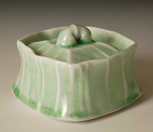
I liked this Howell's box because of it's unique shape. I like that it's not a strange box really, it's just curved. I also love the glazing that was done: it reminds me of leaves.
This was my favorite box. It was made in ancient Korea. I love the simplicity in the shape and lid, and the designs on the side. 
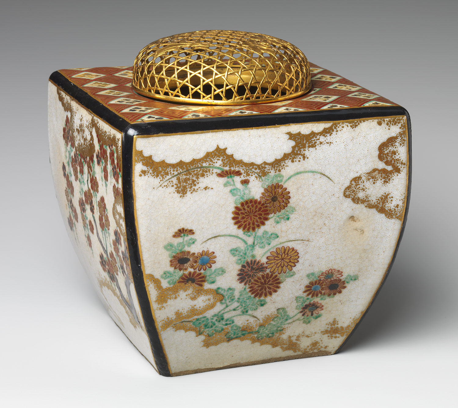
This box-an incense burner for the Edo period in Japan- is my other favorite. The box is still a simple shape but with a twist. I think a box like this would be a fun one to make and a bit more challenging than a cube box

Monday, February 11, 2013

Carving the master relief in clayslab slab slab slab slab slab

Boxes

This Korean cosmetic box uses many other materials on the surface as decoration. The mother-of-pearl inlays remind me of the ones on guitar fretboards, and I think it compliments the black paint and touches of gold.

This Japanese incense box is very interesting in the way that it opens. It has a uniqueness to it with the layering that I wish to try with some projects in the future. The finish is very clean and the decorations seem to tell a story, which is traditional among many Japanese appliances.

These more modern boxes by Betsy Williams are very attractive to me because they are simple and uniform with one another. I like the idea of having a set with similar attributes but a uniqueness to each set piece. These boxes achieve a balance on their own, as well as in a group.

I have not seen anything like this last box. It has a remarkable form because it has an organic feel to it all the while trying to maintain it's purpose as a geometric "box." This thing has a movement to it with the shapes on the surface that makes it look alive.

Boxes


url.jpg

I really like this design, even though it is simple it still has the quality and style of something unique. 

The Box!


This box has a strayed away from the common cube shape that boxes tend to have and goes for more of an oreo-style disk shape. The swirl pattern carved along the sides and on the lid of the box give it a good movement and make up for the lack of color by keeping the eye entertained.


Here is a box that reminds me a lot of an artichoke. Being one of the most difficult to eat veggies I've come across, it is only fitting that a box (possibly designed to keep intruders out) be designed around the plant. The feet and handle the artist are a welcome addition to the box, each giving it a bit of flare to keep it from being a mere cube. The colors and three dimensional aspect that the leaves give are also nice to look at.


This third box that I looked at is my least favorite by far. While it has more curves than the box below, I  am easily bored by the gold and red color scheme the artist has chosen. The strange netting on top would dry out anything that is inside, and is a structural weakness to the whole piece. 


The boring and bland square shape of this box is redeemed for by it's ornate and colorful exterior. The bright earth colors complement the black base color well, and give the impression that something extremely valuable is inside the box. If I had to change something about this box it would be the rhinestone-like pebbles that border the lower section of the box. 

Assignment 5- The Box

This is a Incense box from the Meiji period, I'm drawn to the curve of the box
and the legs on the box draw my eye.
This is a Pen Box from the 13th century, I like the old rustic look, the round edges
and the little latch add to the box.
This is a Tom Hoffman covered box, The color is nice and the design
I like.
This is a Margaret Bohls green leaf covered box, The feet are loped
and draw my eye even more, the detail and color are great.

4 boxes


hb_1996.521a,b_av1.jpgThis historic piece is appealing because of how the lid sits on the body. I really like this because it opens my eyes to new perspectives on the box. As well as different ideas of how handles can be on the lid
hb_2002.258_av1.jpgThis box is awesome because of the great shape and vibrant colors. I like how the sides have not only unique shape but an angle to them instead of straight up and down
373.jpgFor modern I thought this one showed great depth and creativity. I found myself starring at it for quite sometime and getting lost in the shape. 
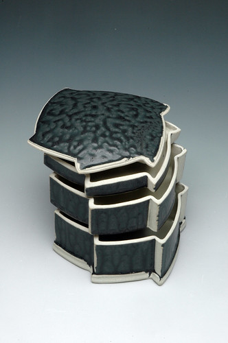
3498.jpgI like how this piece is stacked together and even more impressive that its not square. Each segment fits together really nicely.


Sunday, February 10, 2013

The Box: Always Being Reinvented

 Another piece by Kristen Kieffer, I immediately tied it to her corset piece from two blogs back. She uses the same accenting and color scheme, with what appears to be the same material. Instead of a vessel with the appearance of a corset, this uses a similar design but functions as a box. The lid sits inside the rim of the base on this box, an interesting choice that leaves the lid with a less heavy look, which balances the piece quite well.
This box is extremely ornate, and could be anything from a valuable container to a decoration in and of itself. I like the detail in the painting, and it appears as though the box is out-dented where the paint is, which may be a technique employed during the painting process, or the box may actually indent around the flowers. The colors are very vibrant, which works in helping this box stand out.

I really like that this piece shows the material and is 'imperfect'. The entire piece leans slightly to the right and bulges a bit in the middle, and the ornate designs fall out of symmetry, but i think that if it were what could be deemed perfect, it would have absolutely no character. Other than the perfection this piece finds in imperfection, the reddish-brown designs, accompanied by the vibrant blue accents is beautiful.

I like that this incense burner is almost a completely enclosed box, but for the hole in the top covered by the metal mesh cap. The natural scenes painted on the sides are beautiful, much like other paintings and artwork from the Tokugawa period. It may be because I am enthralled with the style and technique that the Japanese artists used during that era, but this box immediately caught my attention among a group of others.

The Box


I like the lock on this box and how the lid does not overlap the bottom. I would like to put a lock on one of my boxes as well.


The shape of this box is neat and interesting, and again I like how the lid does not overlap.  The color scheme is neat too, I would like to use metallic colors as well.


For this box I like how the lid and the bottom of the box bubble out. The glaze makes those bubbles pop more.


I like how clean and simple this box is. The top of the box has a lip that the lid fits over, and I would like to have that type of lid on my box to make it more secure.

Saturday, February 9, 2013

Box Assignment

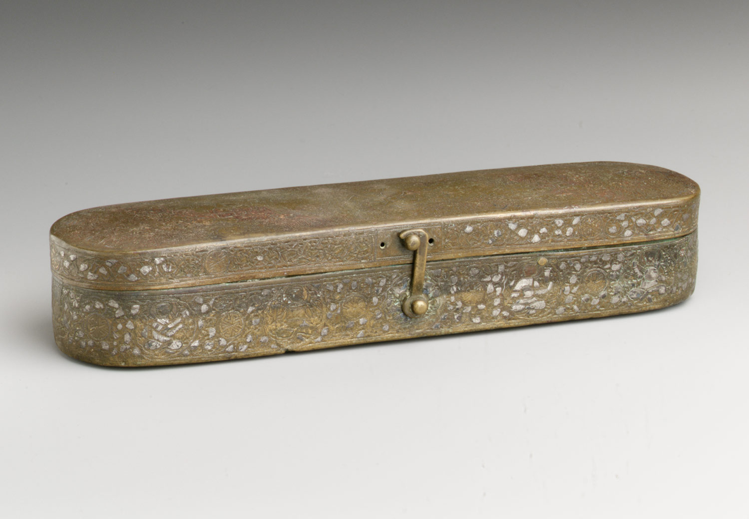
This box is a Muslim metalworkers pen boxes Many that are made are richly decorated with inlays of gold, silver, and copper. Used for Caligraphy pens.


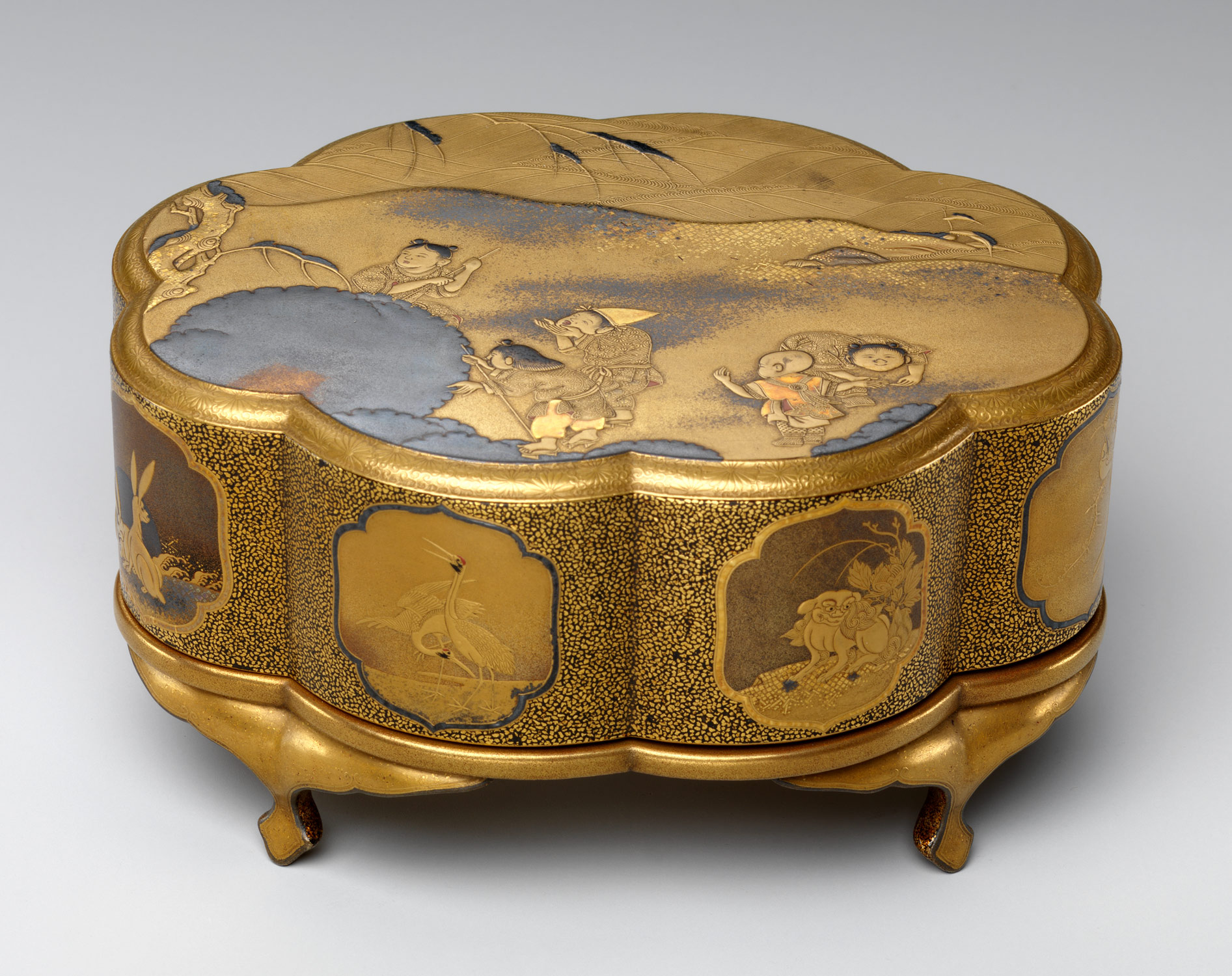
This eight-lobed incense box has small curvy legs. The decoration on the lid shows
This box is of chinese children playing with large snowballs or snowflakes; in the background are a snow-covered tree and waves of a lake. On the side of the box, various symbolic or auspicious animals are depicted in cartouches, such as the hare, tiger, crane, and lion.


The title for this box is called "Colored Leaf Box".  The artist is Hayne Bayless made in 2009 all hand built.  This box has such a fun shape and fun coloring. 


This Three-Tier Stacking Box is my favorite.  The artist is Hayne Bayless made in 2010 all handbuilt.  It is a very extraordinary box and nothing ive ever seen.

Friday, February 8, 2013

Box

This is a gold and enamel box from France, circa 1875. I chose this because it is a beautiful piece and I like the French style from this time period. I also really like the inlay work in the floral print and on the inside. The shape is unique and interesting, it adds to the effect of the piece overall. I like the beading around the lid and the brightness of the colors. The shape might be difficult to do in clay for this project but is definitely something to look into for future works. 


A Korean cosmetic box from the 18th century. Its made of lacquer, mother of pearl and tortoise shell inlays. I like the mix of simplicity in the box itself and intricacy in the inlay and design. I really like the contrast between the black box and the bright inlays.  
This is a contemporary porcelain serving dish. The mint green color looks nice with the design and I like the leaves and quilted pattern. The handles and feet look really good with this piece. It looks like it could be a cake or something edible. An Art teacher was told me that you know art looks good when you want to taste it.

This is another Kristen Kieffer piece. I really like her style and the way she decorates her pieces. I recognized this piece as hers immediately, with the color, design style, and clean edges. I like that the lid fits inside the box and is domed on top. that might be something interesting to try.  

Thursday, February 7, 2013

Boxes

Betsy Williams: 4 hexagonal boxes
The Japanese incense box, the staking box, and even the hexagon boxes all fit together physically and visually. The box with random wavy rounded bumps is really cool looking. The forms of all the boxes look great and I would like to take from one of these designs for my own box. 
Seriously!? Out of Clay!?

Tuesday, February 5, 2013

Assignment 4

I liked these bowls because the leaves on the side are not just painted on, but are carved. I also like the colors used


These bowls were my favorite because of the carvings on the sides, the color, and also the foot. I like that the foot is angled instead of straight up and down. I also like the shape of the bowls. I just really like them a lot
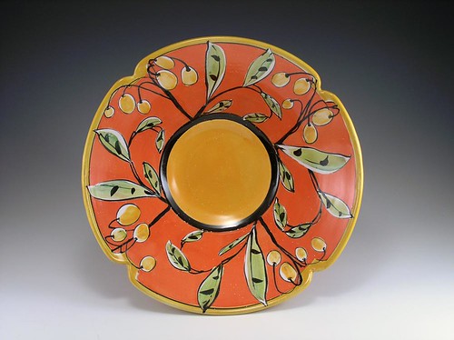
This one I like because of the shape. I like that it is a plate/bowl and then the little indents on the edge. It's a simple change and it looks really nice
This bowl I found interesting because it was clearly trimmed at the bottom and it looks complete but it doesn't have an obvious foot. I really like the pattern on the side of it though


This piece is from India, and I really liked  the foot on this. It's very prominent but it is teared and striped. I think it's a very unique foot and it would be interesting to try something like that