Monday, January 28, 2013

Post Three - Samantha Pepper


This curiously shaped container by Tara Wilson caught my eye because of its odd shape and use of color. The patterning on the left side makes the piece look as though it was made of two different materials, which it very well may have. The piece loks sort of precarious in the way that it was shaped though, and seems to me as though it is balanced and unbalanced at the same time.

These lidded jars by Lis Ziot Summerfield have an interesting use of color, as well as the trays above. Both have similar color schemes, but have totally different feeling. The trays use bold lines and the colors are places on the surface in a way that causes each to stand out. On the other hand, the bottom pieces use a similae color scheme in a softer way, leaving a majority of the piece an off-white color and using the other colors to segment the piece.

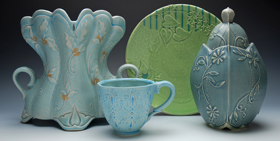
This beautiful blue corset by Kristen Keiffer doesn't appear as a vessel of any sort at first, until one finally looks away from the detail of the piece and finds the handles on either side. It stood out from the other examples associated with this assignment in the fine detail patterning the piece. 

This piece by Mary Berringer stood out inthe simplicity of its color choices. The texture she shose to incorpoate gives the piece an almost aged feeling which to me seems parried by the square on the bottom half that seems more of a modern concept in its delivery. 

roll fold dart


this piece is by jennifer liston. I think it is so cool looking. it has that left over slab of clay look, but she turned it in to something beautiful.


this last two images are both by tara wilson. I love the simplicity of the first cup. I hope to make something similar to that. the last two pieces i love the coloring she did. Im more a fan of the piece of the left, its something that i could actually see myself using.

Assignment 3- Roll it fold it, Brittney Windsor

I like this artiest Tara Wilson. Her design of this piece is unique and the
 bottom feet are striking to the eye.
I like this artiest Liz Zlot Summerfield. Their colerful and interesting.

I like this artiest Oribe. The glasing is interesting, and it looks
old which is what i like about it.
I really like this artest Kristen Kieffer. Her work is beautiful and the
detail makes her work look older.
 

Sunday, January 27, 2013


I really liked this artist, John Gill.  His pieces are brightly colored and abstract, which I think makes them more interesting and fun to look at. 


I also liked the artist Mary Barringer.  Her pieces look aged and like the glaze has faded and the texture has been worn down, but that's why I like them.


I also really likes Mark Pharis.  I like the straight lines and contrast in color.  Also I like the geometric type style in his pieces.

I liked the artist Kristen Kieffer.  I liked the color and the detailing she uses, like the texturing in the design.


Blog post #3 Roll it Fold it Dart it


Tara Wilson
This piece of art i found very interesting.  I like hte handle on top how its so think and how the bottom is so different with its bulkyness.
 
 
Liz Zlot Summerfield
I love the leaf work done on the bottom piece, adds a subtle texture that really makes the art stand out.


Kristen Kieffers
I really like the softness and elegantness of this piece.  Its beautifully crafted detail is stunning. The color is very calming and the small detail is very intricate. 


Blog 3 Roll it, Fold it, Dart it

Kristen Kieffers piece stands out the most to me because of the coloring and detail. The piece has a softer elegance to it in contrast to some of the other pieces we looked at. 

Tara Wilson's piece is simpler and less complex but still has an interesting shape to it. In my opinion it resembles a heart.
I like he originality and shape of Oribe's piece. It stands out and makes you look twice.

Saturday, January 26, 2013

Roll it, Fold it, Dart it

I love the texture Liz Zlot Summerfield has created on these pieces and it works very well with the colors. I would like to try something similar in my own pieces. I also like the accents of red in asymmetrical places.

This piece is absolutely stunning. I am impressed with the amount of intricate detail on the surface and like how the piece is made to resemble a corset. I think the soft blue color works with the embossed design and makes the texture reminiscent of lace. 

Another Summerfield piece, she did several of these styled pieces. This one and a very similar blue one were my favorite. I like the stripes on the side, which are hard to see on this piece but are more apparent on the blue version. The red accents here remind me of winter berries and i like the little handle on top. 

Like the corset style piece above this is made by Kristen Kieffer. Her work is amazing. She does intricate designs on pretty much all of her work and its a style I really like. The pillowing technique works well her with the other pattern. I read how she creates her soft lines, using slip and a trailer (like cake decorating). She does several layers to add visual depth and tactile interest. 

Friday, January 25, 2013

Blog 3 - Roll it Fold it Dart it


I like the way that the lip extends farther out on one side. I would like to do something like this for one of my own pieces.


I like the simplicity of this piece, and how the texture gives it a little more depth.


Again, I like how the lip extends farther out. I also like the scratch like texture that was applied. This shorter version of the extended lip is more of what I'd like to do.


I like the idea of making a platter with a lid. I especially like the detail put into the right side of this lid. It gives me ideas for textures that I would like to put on my own piece.

Thursday, January 24, 2013

Rolling Folding and Darting

Mark Pharis has a very geometric style that is very simple but works well.
Pitcher, wheelthrown and hand-built porcelain, multiple glazes, fired to cone 10 in oxidation.
Deborah Schwartzkopf's work shows that really anything is possible.

Lorna Meaden has very intricate work which is interesting to look at.

Kristen Kieffer's work is very detailed and plant like. On this particular piece I like how the handles are textured and come out almost like octopus tentacles which gives me ideas for aquatic like pieces of my own.
http://www.artfulhome.com/product/Ceramic-Bowl/Family-Bowl/53034
I am trying to upload a picture.  Im so confused.  Just let me on a wheel I'll be ok

Monday, January 21, 2013

Bowls

I found a bowl and a vase, and I love the look of the bowl. It's so simple yet it's so pretty. I love that shade of blue, and the white dots are perfectly placed on the bowl. 

Assignment #2


Series Title: Owan
Artist: Masayoshi Oya
This is a thrown bowl which amazes me with all the texture given to it. Im interested in learning how they created this.  I love all the different bumps and rivets to the bowl.  The color and design gives it an old feel even though it was made in 2010.


Bryce  Brisco: Bowls
 
Artist: Bryce Brisco
Date: 2011

I like how these bowls appear ordinary on the outside and on the inside there is a very cute design.  The outside bowl is very flat looking, but the inside is shiny and a fun surprise.


These last 2  bowls of Ruggieri and Filomena. They were made for an unidentified patron and are painted with busts of illustrious heroes and heroines, ancient and modern. I love hte colors and the artist work put in the bowls.
 

Bowls

I have found several bowls which are inspiring me with my own.

This bowl I like because of the words on the inside. I think script is very aesthetically pleasing regardless of what the words say. I also like the shape of the bowl, although this bowl doesn't have a footing that we can see.

I think this bowl for two reasons. 1 is that I love the shape and the texture on the outide and how smooth the inside is. I think this bowl looks like something I could try to recreate as good practice for my throwing. I also like that instead of just a glaze, the bowl is painted. I think I would like to paint my bowls with thicker colors than just glazing them. I don't like the look of drips and overlapping glazes so I think I will be very careful with glazing/maybe painting.
This plate/bowl is my favorite I have found. I like the pattern and that it's very simple but still very creative and unique. I also like that this bowl has a pattern done in glazes (I think, I don't actually know for sure). I also really like that even though it is a plate, the edges are pulled up so it could be used to hold more soupy dishes.
This last bowl I just love. Even though it has the dripping glaze effect I don't like, I just love it! I really like the color scheme. But this bowl I think is the ideal shape for a bowl. It's deep and not super wide. It's perfect for any soupy dish because you can eat or drink out of it. I think the lip could be a bit smoother but that is my only criticism about its shape. It looks very doable and I plan to model a few of my later and better bowls after this one.

blog 1

sorry this is late! blogging the bowl assignment shortly

Sunday, January 20, 2013

bowl

this was made by a relatively unknown artist with her own blog of her works. but i came across this on a google images search and i really liked it. I like the simple design and how she did the different coloring. Its similar to what id like to try to make when i start throwing.

Saturday, January 19, 2013

Blog Assignment 2: Bowls


The lip of this Fruit Bowl by Deborah Shwartzkopf really drew my attention. I hadn't given much contemplation to the notion of altering them, but this adds another element to the form entirely. The glaze she uses is also very appealing for the piece. I enjoy the touches of red on the external parts.


This set of monochrome bowls appears fairly simple, but that's what I like about them. They have a weathered and ancient look, and the foot raises them off of the surface a little more than other bowls, giving them some air of importance.

This "Sweetheart Bowl" from Don Reitz also plays with the lip of the bowl in other ways. Due to the metallic glazes he uses, this piece as well as others in this collection look very spacey, as if they were extra-terrestrial. I like the somewhat broken and messy form he produced around the edges. It looks like the bottom of the bowl is convex, which brings in different ideas and plays with the reflections in a cool way.

These low-footed bowls are interesting in that they are host to painted bust portraits of heroes and heroines. They offer art as well as being a utilitarian tool for eating. I like the finish of these bowls and the profile paintings remind me of Romanesque art and currency.


Friday, January 18, 2013

Assignment 2: Bowls


 These bowls contain busts of Ruggieri and Filomena and are from around 1520. They were from Italy and are Tin-glazed earthenware. You can see the renaissance inspiration in the painting of the figures, the colors on the latter bowl looking a little baroque with the intense hues. The clothing and head-wear are very interesting and the artist did a good job at making them look golden and extravagant, clearly the patrons are wealthy. 


These bowls are very contemporary looking. The look of texture created by the pinstripes is interesting and the yellow blocks remind me of Legos. I think the color combination of ochre , black and white is working well, and it reminds me of Egyptian artworks.  
These bowls look very modern, like a set you could go buy from the store. I like the patterned texture and think that it works with the solid white glaze. These bowls look elegant and very clean. It is definitely a different style compared to the intricate glaze on the bowls above, but it works in its simplicity.