Thursday, January 17, 2013

Assignment 2 - Bowls


I really like the design on this bowl and would like to try and do something similar on my own bowl. I also like how they're a matching set, however I don't want to make a set during this assignment.


The bowl in itself is pretty intense, but I love the handles sticking up from the bowl. I also like the foot on this bowl. The idea to make that kind of unique foot is very interesting and appealing.


I love everything about this bowl. The shape of the lip is interesting and looks extremely smooth. I also like the sleek design and metallic glaze finish.


Again, the metallic glaze is beautiful, but what I like about this piece is the size of the bowl and how wide it is. The repetition of rain drops is interesting as well. I would like to do a repetitive pattern on my bowls as well.

Wednesday, January 16, 2013

The Center Of The Bowl

Joseph Pintz: Nesting Bowls
The nestling bowls are not that special but I like the idea of stacking bowls.


The rough earthy nature of the second bowl is very cool, but I do not like the smaller base it has. 
Marsh Bowl
The geometric designs in a plant like form is interesting and the color is awesome!
Vessel: Footed Base
Adding a base to a bowl is pretty rad. You could do anything at all with the base and I never really thought of that before.

Monday, January 14, 2013

Assignment 1


I like the creative detail to the pot above. Its so intricate and maticulous with the detail. Now that were dealing with clay ourselves it makes me appreciate all the hard work and time that went into making that pot unique and beautiful.


This demonic head i found very fasinating and also scary. A contemporary piece, created by Roxanne Jackson. The teeth are my favorite part.  Its very creepy and unusual with the teeth also showing through under the eye. The color of the head draws your eye to it.

Tanya Batura

MonochromaF2 by Tanya Batura is a very strange and unusual piece of art.  A face sculpture that looks likes its melting.  Why is it melting? Is the person sad or depressed? I love the gloss added to the work gives a softer look otherwise unusualness of it.
 
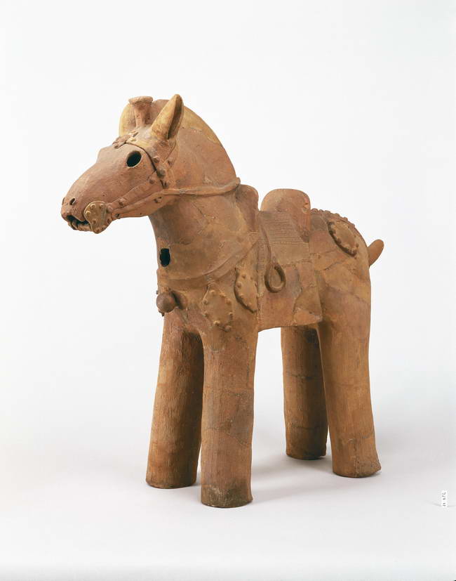
This Haniwa Horse looks very old and interesting.  It looks very simple but at the same time very complex witht he saddle and face piece.

Blog 1


https://blogger.googleusercontent.com/img/b/R29vZ2xl/AVvXsEgcSNitJZFDluv8FOyoQ1SkKZSZZ-26BFuNna4cdDzTWgZNGLxrlIVD-c4qAI0_4I0FurA4R93TKLczpgxRIn1rNRdNjStKwIUw8KsefyDZdODXOEAeng2Q2SRQMhJYkwIIHOj8SRDK_pPe/s400/Haniwa+Boar.jpg
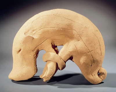
Haniwa Boar Form

This piece really caught my eye because of it's abstractness. The title calls it Boar form but I can see so much more in it, it is very sea creature-like, not much in the way of color but I think that helps make it more "diverse" for lack of a better word.

Haniwa Horse

I really enjoy this piece, if not for my love of horses, simply for the detail in the tack. The figure looks like it may have been made for a child, a plaything of sorts, but even so the creator really took the time to make the bridle and the rest very detailed.


http://opp-m.com/4/4/3/19443/assets/GhwAAmxDJqDtnJSr.jpg

Deafening

This piece really caught my eye, it is quite realistic and just so full of character. This man is clearly old but he has so much life in him, he is thrilled and it is very obvious in his face.


http://opp-m.com/4/4/3/19443/assets/cV4nRjpl8AS6mkG1.jpg

King

I like this piece because of the texture you can see in the face, I'm not sure if that's really textured or if it is just made to look that way but you can see on his forehead how it looks sort of leathery and almost reptile like. I also really think the expression is good. He looks as if he is contemplating something important, although the importance of the thought may be assumed because of the crown on his head.


Assignment 1


This caught my eye because of how evil it looks. The jagged and rough look that tells you not to mess with it.  Deep lines run through the sculpture to add depth. The red lining it is showcased with gives it that extra 'demonic' edge.


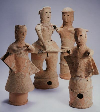
This family of figures looks it has seen better times. Everyone looks a little too sad for my liking. They're all wearing wavy clothes except for the father. Hair is all cut short on what look to be the women, and the father is wearing a rather excellent looking cap.


This guy has a story to tell. His face has been mangled and beaten up, his hair is falling out and he is dressed in some kind of animal hide. Probably the saddest expression I've seen in my life.


This man looks like he is enjoying the moment. He has a calmed expression like he is enjoying a hot shower. Not too much color definition aside from some lines around his eyes and mouth. 

Assignment 1: Haniwa to Contemporary

Haniwa Horse

This figure immediately caught my eye. At first, it seemed sort of childish in execution and reminded me of stuffed dolls, but after a closer look, there are details within the horses bridle that give the piece an interesting mix of soft lines and finite details.

While the piece is not realistic to the extent of being at all mistakable for an actual horse, it does abstract enough basic details of the structure of a horse to obviously represent one. I like the legs, which, if they had been realistic, may not have been able to hold the piece up.
Haniwa House

I really enjoy the sharp lines created by this house, especially since it stood out from the smooth forms of the other pieces from this period. The different line quality was enough to draw me to the piece. The piece, while by some standards simple, seems very complex to me, and I am curious to find out how exhausting such a thing would be to construct.  


Cadaver Stirrup
This contemporary piece, created by Roxanne Jackson is one one my favorite pieces from the selection. I love the macabre influence, but also the whimsical execution of certain aspects as well. The artist keeps the dark quality of the head in the metallic black color applied to the mouth and what appears to be revealed muscle in the face. The light blue stripes that create the skin tone for the piece, however, are light and keep the viewers eyes traveling the length of the piece.


MonochromaF2
This piece, by Tanya Batura, is interesting because it has a somewhat realistic approach to the head, but gives the viewer no bodily context. The head is emerging, or melting into, the black from which it was created, which is mentally intriguing as well as visually. The finish that the artist chose for the piece adds to the character, giving each facet of the piece added shine that draws the viewers attention.


Hey!
Hello

Sunday, January 13, 2013

Assignment 1

This is the Haniwa Horse when I look at this it makes me think of the Trojan Horse. It looks like a strong horse and there's no hoofs that just makes it stronger. The saddle also adds a finish to it.
This is Jomon Figure, This caught my eye when I say the eyes on this one, there blunt and out there making me take a double take an look at this again. There's no bottom part to this that adds mystery, making me think of what could be on the bottom.  
This is the King, the shiny surfaces and the bright crown are what I like about this bust. The eyes being white and the bust being so dark its a nice contrast to the bright blue crown. The ear is also big and looks like it was put there to hold up the crown.
This is the "Red Masked Head" The part of this bust where I was most interested in is the colors, there both bold colors but being faded and darker make the bust peculiar. There are even hole in the bust that look symmetric.

Assignment 1


I liked this Jomon pot because of the pattern and the details. The swirl design over the cross hatched background gives it more depth and is pleasing to look at. It's cool to see pots like this that were made so long ago and have such detail and you can see the work that must have gone into making it. 

I liked this head by Roxanne Jackson because of the color. Also I like the contrast between the blue and the shinny silver of the teeth.  The proportions and overall shape are realistic but details of a normal face are different, like here there's just an ear shape and not all the details in a lifelike ear, which I think makes it really interesting to look at. 

assignment 1


I picked this piece because I like the detail on the pot. The detail looks like a cloth was stitched around the pot. I found the top to be interesting too because it looks like string hanging down.

 Haniwa
I picked these pieces because of the worn and old look they have.  The cracks give these pots character, making them look like they have been used so much that they started to break down. I would like to get this look on my bowls.

Tanya Batura
MonochromaF2 by Tanya Batura
I like this piece because of the sleekness of the clay. Also, I like how the face is emerging from what looks like a puddle of himself. That is what makes this piece so interesting and creates a story behind the man coming out of that mass.

Tip Toland
Deafening by Tip Toland
This piece makes me smile every time. The expression that is being expressed in this piece is so powerful and shows so much life. The wrinkles around his eyes were done very well, and it lets us know that he's had a long and happy life.

Friday, January 11, 2013

Assignment one


Erdahl uses an interesting glaze technique to make this ordinary face look dark and demented. The deconstructed quality and the red on the mouth make me think of the guy as a clown in an old abandoned amusement park. The features themselves are done very well with the wrinkles and facial creases.
                                                                                                 

I found this piece particularly interesting because of the stark contrast between the very dark figure and the bright turquoise crown he wears. I also think the eyes are done extremely well. The artist has created a unique, almost reptilian skin as well and I am curious about his technique for that.  


Haniwa
I chose this house figure because it looks interesting from an architectural perspective and I wonder if it was actually designed after their homes. It also reminds me of the candle holder lanterns.

Jomon
I like this piece because it reminds me of the Greek or Roman style ceramic pots. The detail in the engraving is impressive and I would like to try something like that on my bowls. 

Ceramics

So excited to learn about clay and getting my hands on it!

Introductory Post

I can't wait to start throwing bowls!!

Thursday, January 10, 2013

Hello!

Now that I can finally access this blog, I would just like to say that I am super excited about this class! I can't wait to try out the wheel for the first time!
I too am excited to get my hands in the clay...  Can't wait to try throwing!! I have always had trouble, maybe this time...:)

Wednesday, January 9, 2013

I'm Really Excited to make the Heads!!!!!!

Nick Rouser - Critique 2


These are both sculptures made by Jack Earl. I like how he substitutes the figures head's with action or thoughts related with the figure itself. He makes the viewer ignore the emotion of the facial figures by simply excluded the head itself so we can pay more attention to what he is doing or thinking. In a way I think he is making it easier for the viewer to make an opinion about it considering the viewer does not have to convey the emotion of the figures face.

Nick Rouser - Critique


Both these pieces are sculptures done by Robert Arneson. Aside from being a really dark, gruesome piece, I really like how he conveyed his emotion in both these pieces, as if he were suicidal during these phases of life (assuming both these men are sculptors of himself). I also like how it demonstrates implied motion of the gunshot to the head or the two by four going through his head.

Blog Post 1


The Jomon tall form stood out to me because it had an interesting texture. It is also simple, yet appealing to the eye in its construction and shape. The Haniwa house reminds me of an ancient doll house sort of thing. I wonder if it served a purpose or if it was a decoration.


Thaddeus Erdahl's head "Stevan A Douglas" seems like it could almost be a regular individual, but the glaze options he uses allows a different perspective. The dark tones and lipstick-like red clown makeup give it a mocking and/or nightmarish quality. Roxanne Jackson's "Cadaver Stirrup" was interesting because there wasn't anything else quite like it on the page. Although pretty macabre, it has a unique pattern and color palette, and I like how the shiny teeth show through the cheek area.


Tuesday, January 8, 2013

Ceramic

Kay, I think this is how you do it, but i'm sure. Hopefully i'm doing it right. But i can't wait fo the class to start.

this thing is confusing

I really like how they did the color design on these bowls, and i might try to do something similar to that on my own.

Getting my head togeather


The contemporary figures both have more of a life like quality to them, which I like. The old man seems very real and very creepy where as the other figure is smoothed over in a way that he seems to be coming up from oil. Smooth and life like texture is something I will try when making my own clay figure.


These historic clay figures are very different. I really like the bug eyed Jomon figure, seems like a brutal warrior that will not back down from anything. The Haniwa figure is very simplistic, with only the basic elements to produce a face, the simplicity of that one is something I would like to stay away from when I make my clay figure and go for something a little more detailed and crazy like the Jomon figure.

First Blog

Just accepting my invitation to the blog, excited to get started with the class!
-Kristy Watts
cool