Tuesday, May 29, 2012

Assignment 3 - ancient bowls

Allison Edmisten


This bowl is from Iraq and was made during the 9th century. The specific artists are not listed for the ancient pieces. I like this bowl because of the intricate detail. I also like the faint cracks in the glaze. I am not sure if that is from old age or if it is from the glaze cracking naturally or if the lines were put there. It looks like old age to me. I was wondering if the middle was a word and the description said it means "happiness." I think it is beautiful because I do not recognize whether it is a word or design. 


These are monochrome bowls from Rome and were made during the 1st century. These bowls amaze me because they look exactly like the ones were were making in class. The foot and lip are the proportions we were going for. However, these are so old. It shows that the practicality of a simple bowl like this has been around for centuries. They are also glazed in natural glaze but with color. The turquoise is nice and vibrant. These make me wonder how exactly they were made. Were they thrown on a wheel and trimmed exactly how we made ours? 


This is a tea bowl from the Song dynasty. It is very beautiful and proportionate. The glaze interests me. You can see on the bottom right where the glaze is thicker. It slid down while being fired and pooled towards the bottom. This is a very simple and practical bowl and was probably used regularly. It is interesting that the glaze starts lower than the lip. perhaps it moved or was meant to have the natural rim. 

Monday, May 28, 2012

Assignment 4: Contemporary Bowls - Timothy Spencer

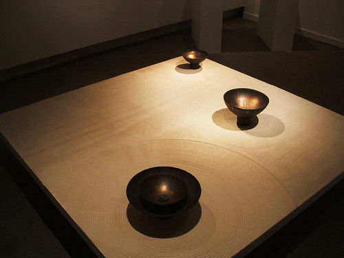
 Since I've been throwing so many bowls, I've gotten to think a lot about each bit of the form of the bowl.  I admire this bowl  by Masayoshi Oya in a way that I never could, had I never thrown a bowl.  The slope of the curve is subtle and continuous, with no bumps or dips. The line is smooth, and the edge tapers up to a thin, comfortable lip.  The foot is small and elegant.  I enjoy the rusty sort of glaze as well, although it doesn't look very functional.
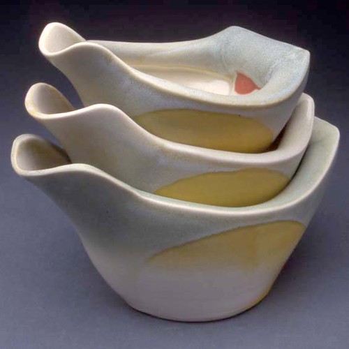
 I like this combination of throwing and handbuilding.  The throwing yeilds beautiful curved forms that I have difficulty achieving in handbuilding, but I enjoy how many ceramic artists adapt those forms and move them to make new forms that couldn't be achieved by one technique alone.  I hope to experiment with this more in the future.  This artist, Deborah Schwartzkopf, is particularly skilled at it, and I think the way these "Pouring Bowls" are intended to be held and used is unique and interesting.
This artist, Kristen Kieffer, is also very good at throwing and then modifying bowls by hand.  These are stamped with a decorative repeating pattern, and it looks like the edges and sides have been worked and indented in places as well.  The simple repetitive design is in some ways old fashioned, but simple and unique enough that it doesn't seem hackneyed.  I also appreciate the somewhat unique shape of the bowls, and how the mouth of the bowl is thinner than the belly, where it turns a sharp corner inward on it's way up.

Wednesday, May 23, 2012

Masayoshi Oya, Deborah Schwartzkopf, & Kristen Kieffer

I love this ensemble called "Untitle" constructed by Masayoshi Oya. There is a unity between the pieces and yet they are all unique and strong alone. I love the almost metallic effect the glazing had on the surface which adds incredible depth and color that I hadn't really seen before.


I've noticed I'm really drawn to pieces that look like they belong in a set or somehow go together. In this set called "Pouring Bowls" by Deborah Schwartzkopf, there are varying sizes of otherwise identical pieces showing the almost carbon copy effect. There had to have been a somewhat mathematical approach to creating the right size ratio for all three pieces to fit so well together as well as meticulous attention paid to detail due to the fact the bowls also have identical glazing patterns.

In case you guys aren't tired of seeing in three's yet, here's another set! I love the look of Middle Eastern art and textiles and that is a big part of why I enjoy this set so much. This set is called "Small stamped bowls, stack" by Kristen Kieffer. I like the using of a color family to show unity through the pieces as well as the differing patterns that also have the same "family" feel to them.

Monday, May 14, 2012

Assignment #3, Bowls


Abigail Woods Anderson

I really like the texture and glaze of this bowl. The bowls form is very deep and simple, my favorite style. I think the porous texture adds to the personality of the bowl. Without the texture or the cool patina, this bowl would just be boring. I chose this bowl because the bowl is simple...I can do simple...but if I take time on the glaze and texture, then my bowl can be magnificent like this one.


I think these bowls are the coolest things ever!! I have worked with clay and shattered glass before and it usually turns out beautiful. I think it would be cool to try something like this. Other than the glass, I enjoy the swirl inside and how the glaze isn't even . Everything works together perfectly.


Sheila Sullivan-Corbitt

Along with the first bowl I talked about, this simple bowl is made interesting with its glaze. I want to do a set of bowls with a dipped runny look to it. I like the dark inside, it gives the bowls a more richer character.


Sophie Milne

These bowls are the complete opposite of the rest, this is why I chose the picture. I want to do a couple bowls with a matte glaze, and definitely try to scrape away designs. I also think that the matte glazes go better with a more open bowl like these are.

Assignment #2 Serving and Drinking Vessels


Liv Antonecchia

I liked the basket look for the serving vessels. Liv gives this serving vessel a simple but cool look to it. I like the green glaze on the handle and inside, then the tanner color and texture on the outside gives it that wicker look. I also liked how she fastened the handle, she makes it look like it would move, just like a wood basket would look like.


Liv Antonecchia

I like the fact that this basket is brown and has two handles. The baskets have the same function, but the look is completely different. This vessel wouldn't be good for any liquids (because of the holes) but would be a perfect bread basket. I also like how she incorporated a platter underneath the basket as well.


Liv Antonecchia

I really like the simplicity of these cups. These cups are subtle but have a lot of detail at the same time. I like the color of the glaze and that there aren't any handles.


Liv Antonecchia 

I picked this last tray because of the design in the middle. I want to do something like that on my tray, but wasn't quite sure how much detail to put into it. I like how simple but to the point she is.


Assignment 1, Heads


Fred Press

When I saw these heads I really enjoyed the colors and patina. I want to do a glaze similar to this on one of my heads. I like the emotion these pieces capture, a very sad lonely look yet they have each other. Also, the base of the piece adds a lot; instead of the piece just floating there, it gives it a sense of completeness. 


Jasmine Gill

I chose this piece because of the hair texture and the proportions of the face. I had a hard time making hair work and tried using slabs, it looked horrible and I ended up with two bald heads. I think the fact that she scrapped away at the clay instead of adding, made the hair look way more realistic. The up do also makes it easier to handle without breaking, and gives more emphasis on the shoulder and ears.


Robert Lohman 

I chose this piece because of the hollowness and lightness this piece has. I had a lot of problems with the eyes of my piece, and this piece has no eyes and gives a sense of emptiness...which is good when talking about this piece. I also enjoyed the hands, they help stabilize the piece and add just the right amount of detail to make this piece all around beautiful.


Tom Bartel

I like the texture in this piece. Instead of smoothing out the head, like the texture of skin, the artist made several random lines with a great patina to capture the wear and tear almost rugged look. I feel that all of these factors really added to the piece as a whole, and without the texture and glaze, this piece would be too ordinary.

Friday, May 11, 2012

Heather Clerf's Assignment 1-Ceramic Heads

Tanya Batura - "MonochromaF2"
This is the piece I used as inspiration for my first head assignment. It reminded me of a picture I saw and a short story I wrote in high school. The picture had bodies poking out of the ground and I saw it as a sort of creation - the bodies being formed from the earth. When I saw this piece it made me think of the person starting to be formed.

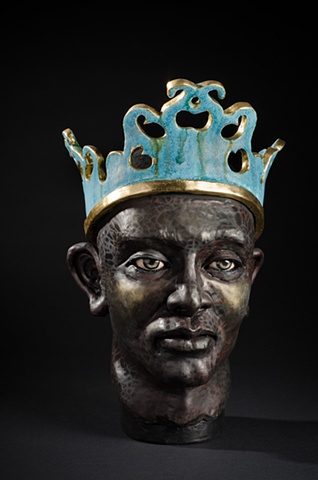
Jacob Foran - "King"
I liked this piece a lot. The eyes are so striking, and the color contrasts bring the piece together. I like how smooth the whole form feels.

Unlisted Artist - "Archetype"
Generally I enjoy the realistic sculptures more than the surreal, but I found this one to be very interesting. Despite the headpiece, the face has smooth lines and curves and looks regal. I also like the use of the gold and negative space.

Tip Toland - "Deafening"
This head caught my eye right away. At first glance it was a little startling and I thought it looked sort of ugly, but after a while I've started to see it as really beautiful. I love the lifelike quality, but beyond that, the simplicity of the imagery is stunning. Our culture has grown to see the elderly as no longer useful and ugly. Other cultures revere their elders and see them as great pillars of knowledge. This old man is beautiful, even with his baldness, missing teeth, and age spots. Toland also did an amazing job with the emotion.

Thursday, May 10, 2012

Ancient Bowls - Tim Spencer


I love this bowl because of the beautiful stylization.  I like how simple the imagery is, and how the two rabbits seem to be moving around the circular bowl shape after each other.  There seem to be a couple of holes in the bottom, which makes me think it must have had a particular use which the holes were necessary for.  I also like the dull brown and white, and the shape of the negative space.


I love the middle eastern tradition of creating compositions out of words. I love that this bowl says 'happiness happiness'.  I imagine eating a big, delicious meal out of this bowl, and getting to the end of the meal and seeing 'happiness happiness' at the bottom.  It makes me want to make my own happiness bowl.  I also really like the quick, gestural lines of the script, and the decorations around the rim, like someone painted them on very quickly and fluidly, as if they had done it a hundred times in a row.  It makes me think about the life of the person who made it in 9th century Iraq. 

I imagine that drinking out of a bowl like this makes you think about what a bowl or cup really is.  If I was just drinking out of paper cup, I would barely notice the cup at all, or think about what a cup could be, or what I was doing with it.  Honestly, I might not even notice that I was drinking out of it, if I was really busy.  On the other hand, this one sort of seems to shout, "I am made of clay!  Someone dug me out of the ground!"  Maybe this sort of bowl makes you think about the moment you're in as well.  There's also a great deal of subtlety in the coloring and shaping. Little bits of red flecks in the black, and a fluctuating surface as you move your hand around it.

Tuesday, May 8, 2012

Bowls-- Tessa Holt


This bowl looks so different when you look at it from the different angles and I really like that about it. Its weird to me though, that it almost looks like it was made in two parts? Like if you look at the bottom it seems like the foot is somehow attached differently than the top. What I don't like about these bowls is that they don't seem all to functional. Like the design work is pretty why would you want to cover it with food or anything like that.


I really like these bowls because they are simple yet functional. They do however look kind of thick? Maybe thats just the way the lighting is hitting them, but the clay looks like it was made thicker on these bowls than the once before it, which gives it the more durable look to it.

I guess this all says a lot about my tastes. I personally like the designs that are interesting, yet still functional. If I am going to pay money for a set of bowls, I want to be able to use them, not just put them in a display cabinet to never be touched.

Bowls - Liz Woodard


This group of bowls looks to me to be completely utilitarian. These to me don't look like something that were used for decoration or as status symbols of wealth. The one thing that does stand out to me is the uniformity in shape.


This tea bowl looks very interesting to me and I thought it was rather large until I looked at the dimensions. I like how it is a tea bowl, but as we were told in class it is actually used as a cup. I think it's shape is rather interesting, it has more straight sides that I would expect from a bowl.


This cup interested me because the description says that it is highly valued in the Japan, however it does not look smooth, is not balanced, and the clay is rough so it makes me wonder why exactly they are so valuable. Is it just because they are made by a family that have done them for generations?

http://artaxis.org/ceramics/meaden_lorna/lorna_meaden/meaden-06.jpg
I like these bowls because they are uniform in shape and style, however, they are still each unique since the paintings on each are different and not uniform.

http://artaxis.org/ceramics/shaw_andy/andy_shaw/bowls(2)(2).jpg
I love the uniformity and simplicity of these bowls! I like how there are a various sizes, however each bowl still has three rows of patterns on them. I wonder how exactly they put the design on these bowls, a press or reductive techniques.

http://artaxis.org/ceramics/spangler_shawn/shawn_spangler/8(2)(2).jpg
I don't understand this bowl. To me it doesn't look very utilitarian or practical for use. This is something that I would just put on a shelf and probably not use. It is very cool with all the accoutrements and different colors and designs on it though.

Research assignment for Bowl assignments 3 and 4


Assignment 3 and 4- The big La Bowl Ski

This first assignment will address some basic throwing skills like wedging, centering, and throwing bowls and trimming feet. This blog research assignment will focus on bowls and their feet within both contemporary and historical ceramics.

These links will lead you into your first influences in the shape and imagery encapsulated in the bowl form.


and check out Paula Mathieu’s Odalisque Bowls

Your job is to think about these bowls. Pick two or three historic bowls and two to three contemporary bowls that you really like and talk a little about them on the 265 blog. Post the images and your commentary for credit towards your research points.

Wednesday, April 25, 2012

Jeff Campana, Robert Sutherland, and Kristen Kieffer

I have been doing a lot of looking and searching for awesome ceramicists, and so far, these three have been my favorite.

Jeff Campana's work is really beautiful. I love the sleek lines he has in his work and the minimal color. I was reading more about his work and apparently he builds or throws his pieces and then dissects them apart and then puts them back together again to get those sleek lines. Here is his gallery: http://jeffcampana.com/photo-archive/

Kristen Kieffer has been very inspiring to me so far. I also am a huge fan of the art nouveau period so seeing that incorporated into ceramics is awesome! I love her stamping, I am very interested in trying that once I throw a good enough piece! I also love the soft colors and the occasional complimentary lines or circles she adds. I also love the nice curves she adds to her bowls. Here is her gallery : http://kiefferceramics.com/gallery/

Robert Sutherland is pretty bad ass. I love the "crackly" glaze and the bright colors that he puts on his pieces. He also gives his pieces interesting shapes that I feel really go along with the specific painting that he does. I would really love to learn how to paint on my pieces like this and learn how to do that crackly glaze! Here is his gallery:
http://www.rob-sutherland.com/

Sunday, April 22, 2012

Kayleigh Butenschoen-Assignment 2

This cup is by Kristen Kieffer, one of my new favorite ceramicists! I absolutely love the decorative details she puts into all of her work. And The colors she uses are beautiful. This piece is a great example. I love the shape of this pitcher, the curved in body and the spout are so delicate. The pattern is also very lovely! 
This is a really interesting piece by Kristen Kieffer. This one is hand built and has some very awesome darting technique! I love how the pattern moves with the piece. Overall there seems to be a lot of movement in the piece. 
This piece by Holly Hatch is awesome! I love her decorative style. Her intricate hand painted details are lovely. I also love the way she presents her work, by hanging her pieces on the wall and having a frame around them. The aesthetics are very pleasing to the eye. 
Another piece by Holly Hatch. It reminds me of an old antique chinese plate. The little waves and the line outlining the dent of the inside of the plate are really nice little touches. It makes me wonder if she is of asian decent. Lovely little piece!  


Kayleigh Butenschoen-Assignment 1

Kayleigh Butenschoen
Assignment 1 Heads

I think this head by Tip Toland is plain weird. The craftsmanship is really nice, and I love all of the wrinkles and the color of the head. I think the missing teeth added a really nice "goofiness" to the piece. It kind of reminds me of what Golem would have looked like before he went crazy! I also appreciate the veins in the neck. Overall, a really well done piece. 
This piece by Jacob Foran is pretty stellar in my opinion. I love the contrast of the gold and bright blue again the textured black head. I think that the cold stare and the steely grey in the eyes really give it a coldness to the piece. I think that the texture in the face is beautiful. The crown is really interesting to, it makes me want to see the top of the head. I feel like there is something on the top that we are missing. 
This piece by Judy Fox is interesting. It seems like a very traditional Korean or East Indian head. The details in the head piece makes me think more Korean. I like the old affect of the paint, I think it gives a nice "vintage" appeal to it. I also really appreciate the details in the head piece. I can't really see the hair in the back, but from what I can see in the front it doesn't seem right. It seems to bulky to be on this head. 
This head by Tanya Batura really makes my skin crawl. The morphed neck and shoulder kind of make my stomach hurt. Probably because of the unnaturalness of it. The figure looks like it is melting, and the black adds to that affect, kind of like hardened lava or something. It is interesting that she made the figure glossy, it seems like it should be matte. Overall, interesting but disturbing piece!


Wednesday, April 18, 2012

Assignment 2 - Eating and Drinking Vessels

Allison Edmisten

 Liz Zlot Summerfield 

These really caught my eye because of their shape. The base, how the clay is folded, and the lines make them look like they are origami and made of paper. I also like the split in the middle, with two different textures and designs. It is very interesting and beautiful at the same time. It looks like the an intentional origami design, but maybe she even made them like someone would make origami, but with a thin slab of clay instead of paper.  

Scott Jupiter

These mugs are quite interesting. They are done as a custom job to a client, who must have requested the spikes. It looks like the cup was spun and the handle and spikes were hand built to add to them. I notice that the handles seem huge, but maybe that is because they have to be pronounced, because they must be used. If someone chose not to use the handle they would get pricked by the spikes! I am not sure If I would want to use these cups, but it gives me a whole new light on possibilities or ways to manipulate the textures, or add details for a purpose or for aesthetics.  

 Claire Prenton

This is by far my favorite and I want to buy it! I love the wilderness concept of her work. The green earth tones, the wood, the leaves and things on the lid. I think this piece is interesting because of the base and all of the added detail. It looks like it is standing on a base made of branches... or are the branches made of clay? My guess, is that they are made of clay because it is so conforming to the piece and fits perfectly... almost impossible to find naturally. I could look at this for hours because it is so beautiful. 

Claire Prenton

I chose another one of her pieces in the same collection because I am drawn to them. This one is different because it is a pitcher rather than a storage piece. I think the spout is very interesting, it is open but shaped and designed as a leaf. The concept of bringing in a theme to the work is a great idea. I also like the imprinting done on the sides. The base looks like a leaf was pressed into it, but it could easily be drawn on. The acorn and other details must have been drawn. I would like to know the step by step process of making these. This also looks like it was hand build rather than spun on the wheel. I like the bottom, because it is separate from the rest of the body, with the prominent boarder and line. 

Assignment 1 - Ceramic Heads

Allison Edmisten

Helga Prosser

The thing I like most about this head is the incorporation of hair. The artist had several heads on her website with different styles of hair. This is a bit more stingy and not as natural looking as the others, but I think it is a great way to do it. She is also very realistic looking. I prefer the sculptures that are realistic rather than exaggerated, even though I appreciate both. 

 John Asaro

This head was quite striking to me because it is extremely realistic but also very abstract at the same time. No real person has such lines, but the features are created perfectly. I like how the lines enhance the features of the face, while changing them at the same time. It is a very interesting concept and not one that I have seen a lot in sculptures. 


Screaming Man

This head was from an artist in the UK, but it did not list the name. The thing I like most is the incorporation of real objects to enhance the clay. The artist added jewelry, and it looks like some other material for the hair. It is also very cool how the tattoo was drawn on, but the the rest of the head is vary pale and still clay colored. I love the expressions and how the artist scrunched his face into a screaming man, with the squinted eyes and furrowed brow. There are many elements that play together for this head, and make it so great and interesting to look at.